The Bird Paradox
A good way to explain the concept of on-screen distractions is what I call the bird-paradox. You’ve probably played flappy bird by now and are wondering, “What does this have to do with distraction-free experiences?”. Quite a lot as it turns out.
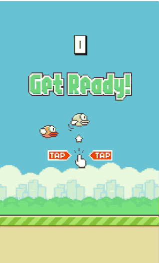
This whole game is all about focus. The slightest distraction results in an immediate death, pain and frustration. There are a ridiculous amount of articles out there sharing tips on how to improve. It wasn’t until a friend told me to stop glancing at the score, that I was able to take my game to the next level. If you think about it, all he was really saying was “focus on the essence of the game”.
Obviously, designing reading experiences is not the same as designing a game but it brings up a worthwhile question:
Why do designers impede their readers with such a huge amount of bullshit?
Let’s see how we can spare readers from this misery by designing reading experiences that put readers first.
On type & content
Typography and content obviously build the fundamental building block of everything that is meant to be read.
In fact, so much has been said about it already, we could probably fill libraries based on the topic of crafting and setting beautiful and readable type. That’s not the point of this article. It’s important to be aware that typography has the most profound impact in the perception and interpretation of our work though.
Read Matthew Butterick’s practical typography guide.
You will find a few rules that, when applied, significantly improve reading experiences. Bad typography doesn’t just look bad, it’s highly distracting, makes peoples thoughts wander, is tiresome and ineffective.
Do yourself and your readers a favor: Find out how type works.
On imitating deliberately
Blindly copying a physical object and translating it to the digital realm is usually a poor design approach. Erik Spiekermann once said:
People read best, what they read most
Imitating books, newspapers, and magazines worked well because most of us are used to reading them for decades. This isn’t the case anymore. Both the medium and the reader have evolved. We no longer need these classic metaphors because we’ve gotten used to hardware as an actual medium for reading.

When it comes to continuous content like written text, let people read the way they want to. Content breaks, like page flip effects cut content into arbitrary pieces and force the reader to refocus. Apple now gives iBooks users the option to switch reading mode between “scrolling” and “page-flips” for good reasons.
If you really want people to experience your content like a physical book, go print a book instead.
On position fixed
On the web, we make extensive use of position fixed. Many designers use it to provide global options, most notably navigation and logo. Let’s have a look at an example: Focuslab LLC. A design studio from the U.S.:
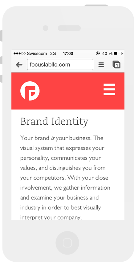
Focuslab presents itself in a colorful, beautiful design with carefully crafted type. As soon as you start scrolling, you get the typical fixed header on top.
Now seriously: whose logo is so beautiful that it deserves such a huge amount of space on a screen?
When we redesigned Holtzbrinck.com, one of the leading media companies in the world, we broke down all the information to one single page. Since the page become so long, we knew that we needed to give the user a means to navigate in a quick and easy way but we didn’t want to sacrifice readability. So we came up with a different solution:
By fixing only the mobile button to the viewport and by ragging the button to the right, we get both a good reading experience and an easily accessible navigation.
How about sticky elements?
While sticky elements do share a lot of similarities with position fixed items, there is one major difference. They are not fixed from the beginning. As a result, they distract readers with unexpected visual changes.
While the sticky element pattern is very powerful for apps, it usually doesn’t add any real value to readability. The only time you want to use this pattern is when you’re dealing with long-form content that needs contextual navigation to improve orientation.
On sidebars
When designers start working on a web comp, they usually begin fleshing out the important stuff first. At some point they proudly look at their masterpiece in awe and realize, there is still plenty of whitespace available on large screens. It’s just a matter of time until a smart work colleague comes around the corner, suggesting the most obvious of all: “Hey! This design needs more stuff. Let’s add a sidebar! Because sidebars are cool, and people love them!”
By doing this, the designer unintentionally opened Pandora’s box, creating a space that suddenly grows and grows to become a cluttered place full of shit.
I think Oliver Reichenstein said it best when he wrote:
The only side column you look at is your own side column.
If you think sidebars are cool and an absolute necessity, at least make sure its content isn’t obtrusive. Animated content, images and big headlines are classic traps. Applying a vertical rhythm helps for a more seamless integration.
But again… In most cases you’ll realize that you’ll do just fine without it. Once you made up your mind, remove it with a determined move, hitting backspace without any hesitation.

You won’t regret it.
Keep animations simple
In my post about transitions, I discussed how valuable the appropriate use of transitions & animations can be. When it comes to reading, everything that moves, shakes, pulses or even flies around is nothing but a distraction.
Long-form articles benefit from the smart use of occasional effects and multimedia embedding to increase attention span. It’s tough to hear and I hate breaking it to you: If users leave when no fancy effects are present, it’s usually a clear sign that content is probably not as good as you thought it is.
Take The Verge as an example. They wrote a beautiful article about fanboys of different brands. It’s a very entertaining read that changes its look and feel, as you use a different kind of device to access the article (OS X, Windows, Android). Reading it is actually quite a challenge. Check it out:
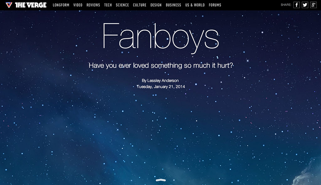
The worst about this kind of animation is that after a short time, it fails to build any anticipation. People already know what’s going to happen next, it loses its charm but keeps on distracting the reader.
When it’s time for content to shine its light, it’s better to use animation wizardry sparingly.
Dealing with advertising
Brad Frost said advertising is bullshit. Having worked in advertising for some time, I’m pretty sure we need a more nuanced perspective here. It’s bad advertising and bad ad placement that sucks rather than advertising in and of itself. We try to avoid bad advertising just as we try to avoid bad web sites. Advertising is an integral part of the web as we know it today – one of the many reasons so much content is freely accessible. It’s just that ad men have traditionally gone too far, cluttering our screens with a ludicrous amount of irrelevant and obtrusive shit.
Today, we all know how that turned out. People install Adblocker and the guys who follow the “more ads are always better” mantra suddenly find themselves in a pretty dark spot.
Advertising is definitely gonna stick around, so we better start dealing with it. One way not to do it is how Forbes Magazine does. I tried to read some stuff about management on their website and the first thing I saw is this:
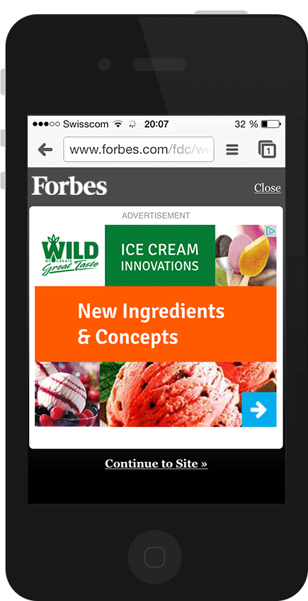
Now, unless all managers are a bunch of notorious ice cream addicts this ad will probably not be of any sort of relevance whatsoever. If you click on it though, it only gets more frustrating as you realize that this brand doesn’t even exist in your country.

People who value their time are probably gone by now. Let’s see what happens if the user proceeds at this point:
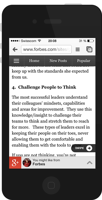
Now look what we have here. A fixed header bar, a dubious next arrow and a flashing banner at the bottom. Combined, these “features” get so distracting that the site should probably get it’s own warning sign for potentially causing epileptic seizures in visitors.
So what’s the consequence here?
Simple: I stopped reading – and I did so for two reasons. First, the way content is presented on mobile makes it look cheap. It’s highly distracting, inefficient, and creates an uncomfortable, difficult reading experience. Secondly, it’s an insult for both the person who made a great effort to write compelling content as well as the reader who has a hard time reading it. People will either use tools to remove visual noise, as discussed initially, or they’ll find more legible alternatives.
Admittedly, including advertising while still maintaining a great reading experience is not easy. It’s especially hard on mobile. There is a simple rule we can follow that helps a lot though:
Don’t make people guess if something is an ad or not.
Quartz Magazine is a great reference on how to advertise on mobile. They only show one relevant ad at the bottom of each article in a very unobtrusive way.
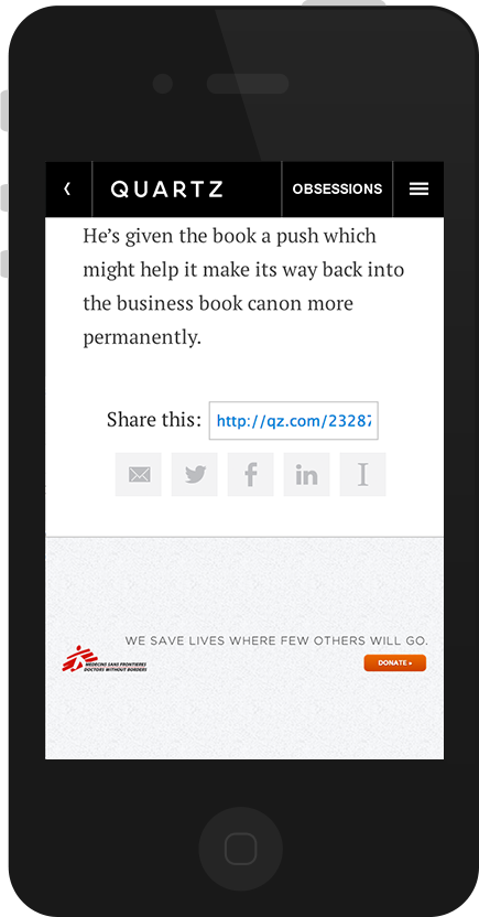
They experimented with lots of different versions and found that people actually like ads if they’re good. Also, quality seems to trump quantity by far.
Advertising does remain a really tough challenge in today’s web. I certainly don’t have the best answer but we all know somewhere deep down in our hearts: we can do better than that. By simply being a little more deliberate in the way we place and show ads, I believe we get both an improved reading experience and a more sincere and respectful interaction with all involved parties.
On pagination
When you go on a web site, you usually want to do a quick scan and check whether there is any content matching your needs. Unfortunately the guy who decided to paginate the layout didn’t take you into account. What you end up pushing your way through is something like this:

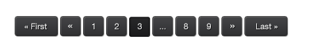
You can design the most beautiful navigation button there is but at the end of the day, readers couldn’t care less. People don’t go to a web site to click buttons, they want to find information. Artificially increasing page views through pagination is a really evil thing to do. Anyone who argues this kind of reading is more convenient because readers don’t need to scroll is a person you don’t wanna waste your time arguing with.
Several studies clearly indicate that first of all, users do scroll, and secondly, that they prefer the view-all over the single-page version.
The only exception here is when content is extraordinarily complex, or draws heavily on bandwidth. The good news is we don’t need to prove that users scroll anymore. It has been researched extensively — they do.
Let people read what they came for
All too often we are overwhelmed with many options to navigate to other places before we even start reading:
- Main navigation
- Sub navigation
- Next & previous posts
- Recommended articles
- Similar articles
- Blog rolls
- Footer
- etc.
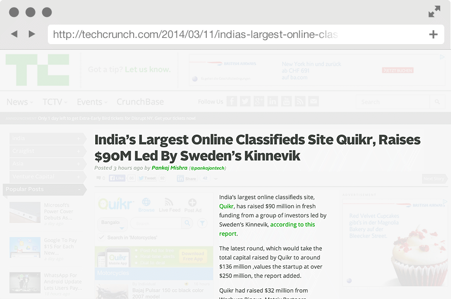
Companies like Techcrunch can’t exist without readers. This is remarkable if you consider that not even a third of the screen is used to display the actual article.
Having too many options is overwhelming. Let’s say you go to a restaurant with tons of delicious options to choose from. What starts as a pleasant and inspiring mental food porn cinema quickly gets you in a bloodcurdling situation, forcing you to make a tough decision:
What is it gonna be tonight? The hamburger or the pizza?
No matter what you decide, you will wonder whether you made the right decision and how the other menu might have tasted.
Too much choice increases our costs
Users who land on an article page face the same problem. If they spot another potentially interesting article right from the start, they’ll already be curious about that next article instead of enjoying the one they’re currently on. They get mentally distracted. And that’s only one issue besides cognitive overload.
Information architecture tends to move away from a hierarchical towards a bottom-up approach. In most cases, people don’t start using web sites from the index page anymore. Instead, they dive in via search engines and begin their journey somewhere deep down the rabbit hole. The only thing users care about at this moment is whether content on the screen matches their needs.
Mandy Brown wrote in her article on A List Apart that the design of a page should respect the different phases of the reader. It starts with inviting the reader, leaving them alone during the reading process and finally offering additional venues to pursue their interests.
On Images
Images strongly influence the way we perceive web sites since they quickly and easily convey one of the most fundamental part of design: emotion.
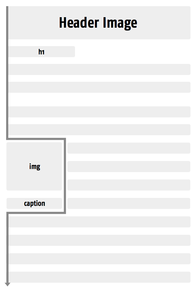
Surprisingly, we rarely question how to make use of images in a more effective and less distracting way. Consider the following structure of a web site:
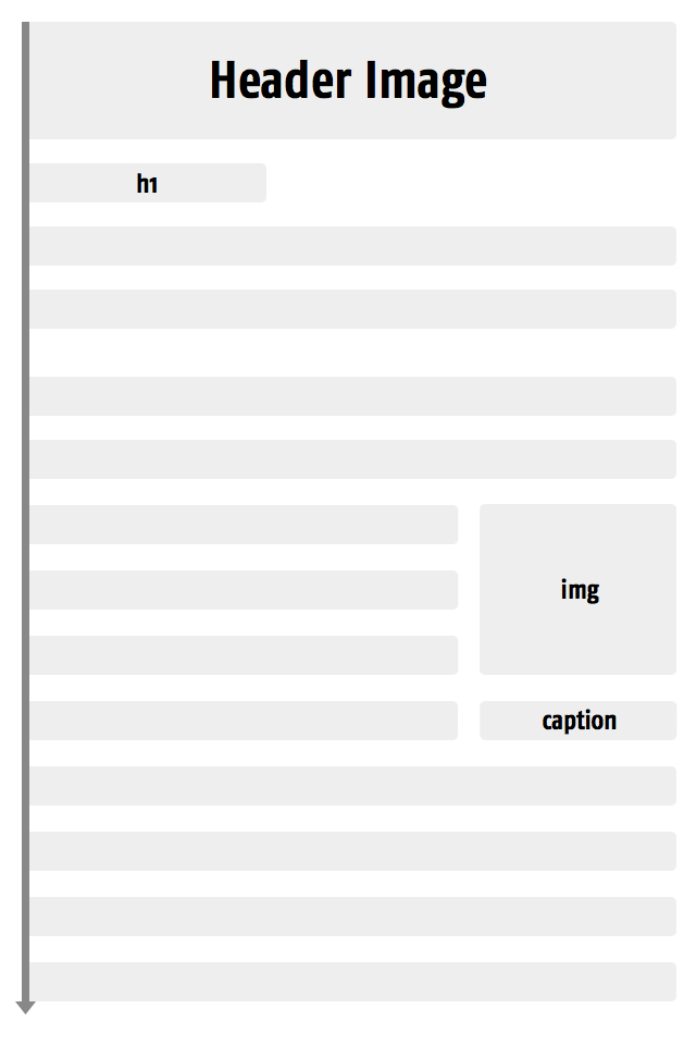
The guys from Kissmetics analyzed how the position of images influences reading behavior and the way we scan web sites. They found that it’s more effective to have a header image placed above the main headline, ensuring that the images don’t interfere with the reading flow. Otherwise, whenever you start reading, the header image would always interrupt you.
Another interesting fact is the position of inline images and captions. Captions are read about 300 times more than actual body copy. So we better make damn sure these captions sit tight.
Inline images that float along body copy should preferably be ragged to the right. This results in a more comfortable reading experience, since readers don’t have to readjust their eyes during the return sweep (the movement of the eyes from the end of one line to the beginning of the next).
Compare the return sweep line (dark grey) above with the one below.
What about image content? More specifically, what about the use of stock images like this:

Obvious stock images will distract your readers with their visual dominance, without the benefit of interesting your readers with their content.
Bnonn Tennant
This image didn’t just interrupt your reading flow, it’s also dull, boring and does an impeccable job in boring the shit out of every other visitor too. What does this kind of image actually communicate? That a company has really nice pens? That people actually work together or the fact that they work with laptops from 1999?
These kind of images are huge turn off for visitors. I hope it didn’t creep you out while scanning through the article. Let’s make sure we use images reasonably, since they increase loading time significantly and should therefore be used deliberately.
It all comes down to moments of truth
At the end of the day, it all comes down to moments of truth, these rare moments by which other people judge our abilities, our performance and even our personality. It doesn’t really matter whether it’s at an exam, at a job interview, or when speaking at a conference — people will shape their impression based on these moments.
When a user fires up a project we’ve designed, full of expectations, this is in many ways one of these moments. It’s at this point we need to decide who we want to be.
Do we want to be the nitty-gritty mean little bastards who add noise to the web and impede people to get their messages across, or do we want to be the ones who push the web forward and help to make it a better place for reading and discovering information?
It’s up to us.