Some designers say hover is dead. Some say it’s cool. And some are downright confused about it. Hover has been around for ages and yet, many still struggle how to properly use it.
At a recent IxDA workshop in Switzerland one of the first subjects I explored with students was hover states.
Let’s look at an example.
When browsing a portfolio turns into an easter egg hunt
Take the typical agency 101 website. Beautiful logo on top. Bold headlines how they’re different from their competitors, and naturally… big portfolio thumbnails with fancy hover animations!

Let’s take a closer look how this works out in action.
First, you need to hover over every single thumbnail before you see content that might be critical for navigation. The only way to orient yourself is to play the nifty “hover puzzle” the designer created. Who are your clients? Hover to find out! When was this work done? Hover to find out! What kind of work was involved? … You get the idea.
When navigating a website or app feels like a point and click adventure, it’s probably a good time to rethink your design strategy.
It’s pretty obvious why the above interaction is so annoying: You’re hiding content that’s critical for navigation.
Does this mean we should ditch hover altogether? Not necessarily.
Using hover in meaningful ways
Using hover in meaningful ways means fully understanding what you’re trying to accomplish. Just because hover doesn’t exist on mobile doesn’t mean we should abolish it. I believe all we need is to change our mode of thinking.
Instead of thinking of hover as the trigger, we should think of it as a progressive enhancement. Improve the experience for devices that support it and find an appropriate equivalent for devices that don’t.
Ditching hover simply because it isn’t available on mobile isn’t a sound approach. It’s a lazy one. Hover can still be useful.
Interaction Cues
Subtle feedbacks can go a long way in a world that becomes increasingly flat. Let’s look at some Material Design examples.
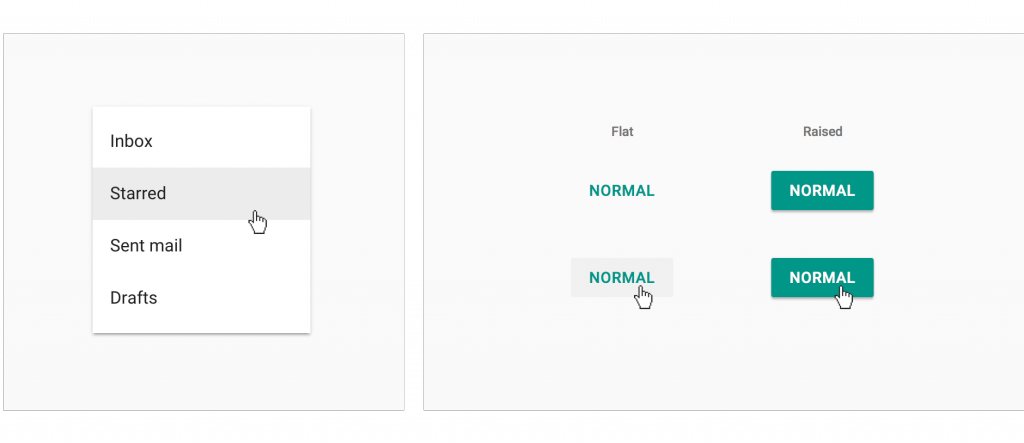
Note how the flat button in Material Design changes its background on hover while the raised button doesn’t. It improves the button’s affordance. The subtle background in a drop-down menu helps users navigate in a more confident and efficient way.
We can use these kinds of cues to progressively enhance experiences on devices that support hover, without compromising the experience for those that don’t.
Contextual enhancements
On desktop, contexutal hover establishes a clear relationship between an object and its options and can buy the user some extra time.
Take Instapaper as an example. It allows you to archive articles without the burden of navigating to the detail view. The large hover target ensures options get easily discovered, while at the same time, making navigation and article management more efficient.
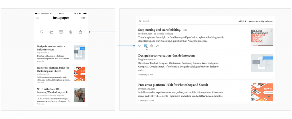
The mobile app implements the hover’s natural equivalent: a swipeable cell pattern as seen across many different apps on iOS. In the web version, options only become available once the user has navigated to the detail screen.
Takeaway
Our obsession with creating simple looking interfaces and websites tempts us to sweep content and options under the rug. Hiding those behind an interaction can occasionaly help to declutter an interface. However, we must ensure users can still discover content and relevant options in an easy way.
Let’s always be deliberate when combining hover and progressive disclosure. Our users will thank us one day. Now let’s go out and build a snowman. ☃