
Update notice: A new version of this post is available on smashingmagazine.
There are websites that outperform others. Whether it’s in terms of content, usability, design, features etc. I believe that details in interaction design and animation make a fundamental difference in the realm of contemporary web sites / applications.
When we design digital products, we often use design applications like Photoshop or Sketch. Most people who have been in the business for a few years know that design is more than just visual representation. Still they are creating static designs. Steve Jobs said:
Design is much more than how something looks like and feels like, design is how it works.
Our experiences and impressions of products are shaped by a combination of different factors with interaction playing a fundamental role in it. No longer can we think of user interfaces as static designs and add the magic of interaction later on. Instead we need to embrace the interactive nature of the web from the very beginning and think of it as natural constituent.
Let’s have a look at some examples where smart interactions gently improve the user experience.
Animated Scrolling
The blessing and the curse of the web are hyperlinks. As you click on a link, they can literally take you anywhere. From a product page to the creepy old puppet store down the street in Wisconsin. The result: loss of context.
One of the great things about books in terms of user experience is linearity. Chapters in a book build upon each other. You read chapter one in the economy primer to understand chapter two. When you skip a chapter, you are aware that you might miss out something and therefore lack some knowledge for subsequent content. On the web, and especially on longer websites, this often happens in a sub-conscious manner. By adding a scrolling animation we can change that:

vs…

Compare the default behavior of # anchor links with the animated one. Skipping content is not an unconscious action anymore; it’s a decision. In fact, the website of hopelies has a button that sends you on the top of the page without any animation. It took me more than a minute to figure out what actually happened. Abrupt changes are hard to process for users. Don’t leave them in the dark, show them what’s happening.
Subtlety in transitions
As we have seen in the last example, subtle transitions can contribute to the effective understanding of pacing and flow of a user interface. Yet another example: toggle menus. The “plus”-symbol is a learned behavior. Its expected actions are add and expand. Just by rotating the plus symbol by 45 degrees, you will get a cross. A user interface component widely understood as “closing”:

This tiny transition completely changes the conceptual meaning of the button. Users will understand what’s happening next in either state. That’s a pretty user friendly toggle if you ask me.
Drag ‘n’ drop
Drag & Drop is one of the most used features on computers. But guess what? It wasn’t always like that. When Microsoft introduced Windows 3.11 they faced a delicate challenge: how to introduce a new interaction concept to users who have just started using the mouse? They came up with a phenomenal solution.
What did they do? They created a card playing game that allows players to drag and drop cards on a table. Your parents are probably addicted to it; It’s Microsoft Solitaire. Ever since people can’t imagine using computers without drag & drop anymore.
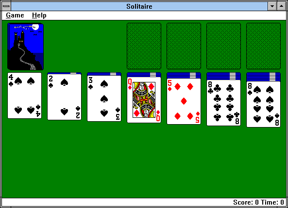
MS solitaire running on Windows 3.11
Interestingly, even though drag & drop is deeply integrated in most operating systems, lots of web applications still don’t take advantage of it. Imagine Gmail without the ability to drag attachments to mails. It would feel odd. If it doesn’t for you, it’s because you got so accustomed to the file browser dialog.
Imagine Photoshop without drag and drop. It would be useless. There are tons of other interaction paradigms which could make applications much more intuitive and efficient. Think about ways you can integrate them intelligently in your projects.
Collapsed Forms & Comments
When you are reading blog posts or surfing on news paper websites you often see frowning comment forms. Why are they frowning? Well most of them are not exactly friendly right? When you are in the mental state of writing a comment, that action is referred to as being top of mind. Instead forms ask you all kinds of other stuff first. In order to motivate people to comment, we can collapse the form and only show the text input. When the user intends to write a message, you expand the form accordingly.
The NY Times is using this kind of progressive disclosure on their new prototype site. You can take this even further by setting the focus to the respective field when the form is fully expanded. Another great benefit of collapsed comments is the scrollbar reflecting the actual length of the article instead of the whole page.
Pull to refresh
One of the most exciting interactions we’ve seen recently was the “pull to refresh”-interaction pioneered by Loren Brichter in the early versions of iOS. It allows you to update scrollable, reverse chronological content. You can see this concept in action in the Twitter app. While you are scrolling up reaching the top of your tweets, you can scroll a little further to refresh the Twitter stream.
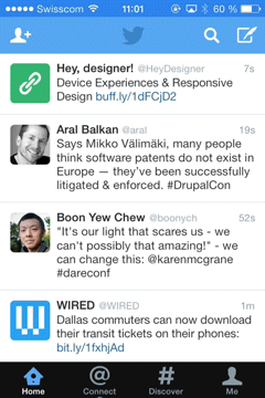
The interaction feels completely natural as the user intuitively wants more content. Before, users were scrolling to the top and would hit the refresh button as there was no more content. By connecting the intent of finding more content with the action of initiating a refresh, the need for an explicit action became obsolete. We get more seamless experiences by connecting intent with action.
Focus transitions
About a week ago, Nikita Vasilyev, a Toronto based UI designer, came up with a pretty neat idea. He developed a script that animates focused elements. While still experimental, the concept is pretty interesting. Have a look at his video below (please put your earphones on. the music is epic):
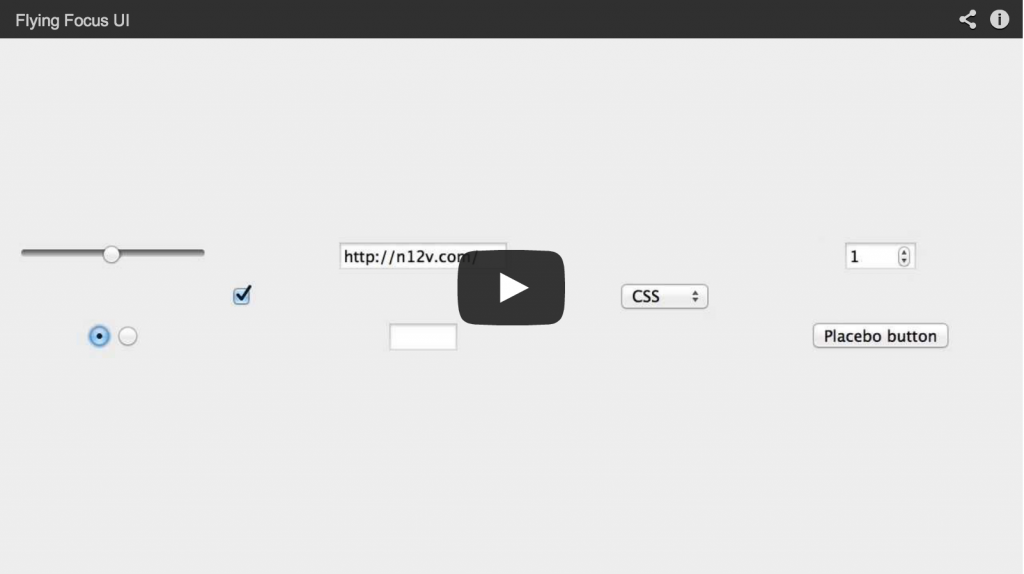
Animated focus transitions
When you use keyboard navigation it’s often not clear where the focus moves upon pressing the tab key. The animation helps users to visually focus on the right spot within the web site.
Conclusion
After being confronted by so many interaction techniques, we often tend to think that they are pretty obvious. When Apple introduced touch based scrolling on the iPhone it was a total game changer. Touch existed already but you had to drag the scrollbar by using a stylus (yes, a stylus). Using the finger to directly manipulate contents was a leap in terms of user experience and technology. The concept feels completely natural. It isn’t obvious though.
If we are to design better digital products we need to challenge our current beliefs and see where useful interaction concepts could potentially ease users` life. I’m not saying we should reinvent the wheel but it would be pretty naive to stop exploring. So go out. Leave your comfort zone. Explore and test.