mono
studio
brand
Created visual language and motion based logo system for the internal design studio I ran at Google called "mono".
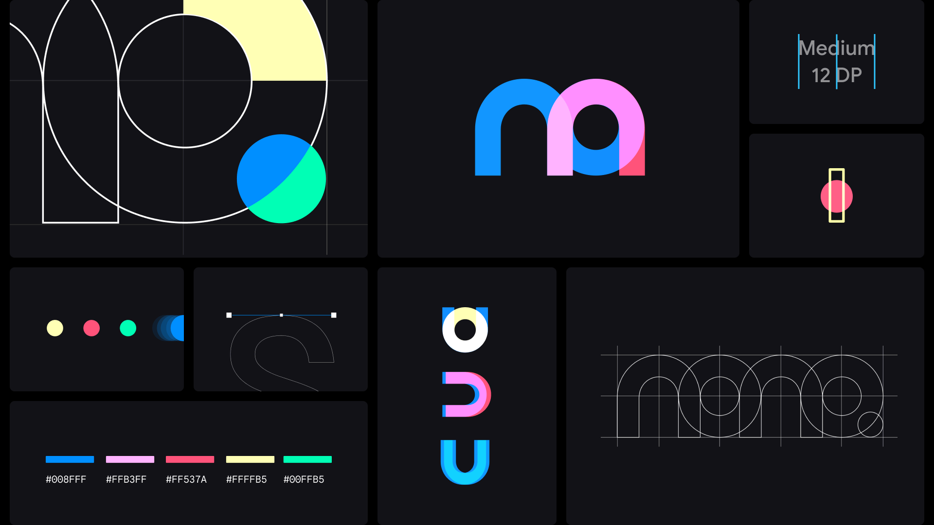
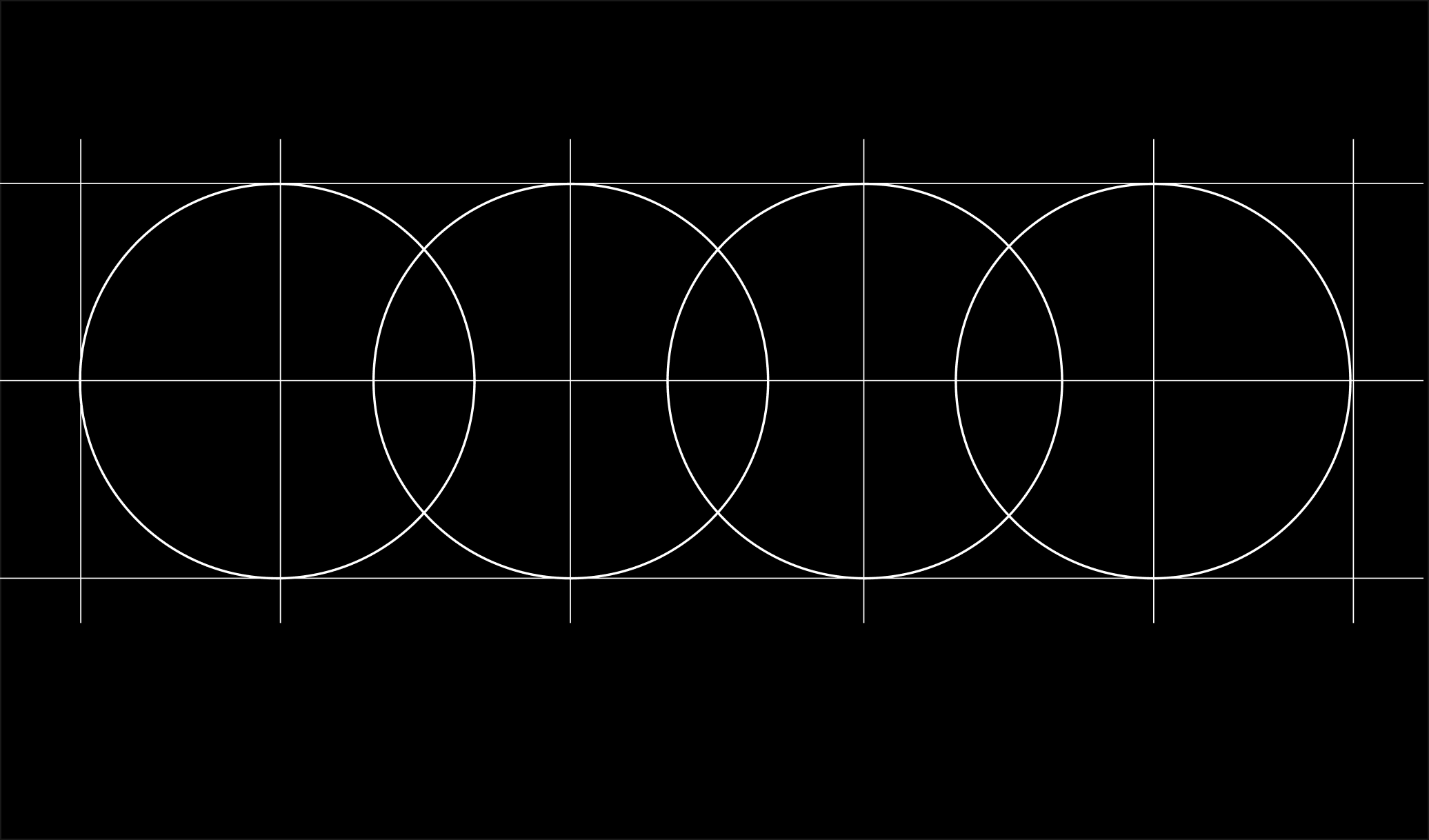
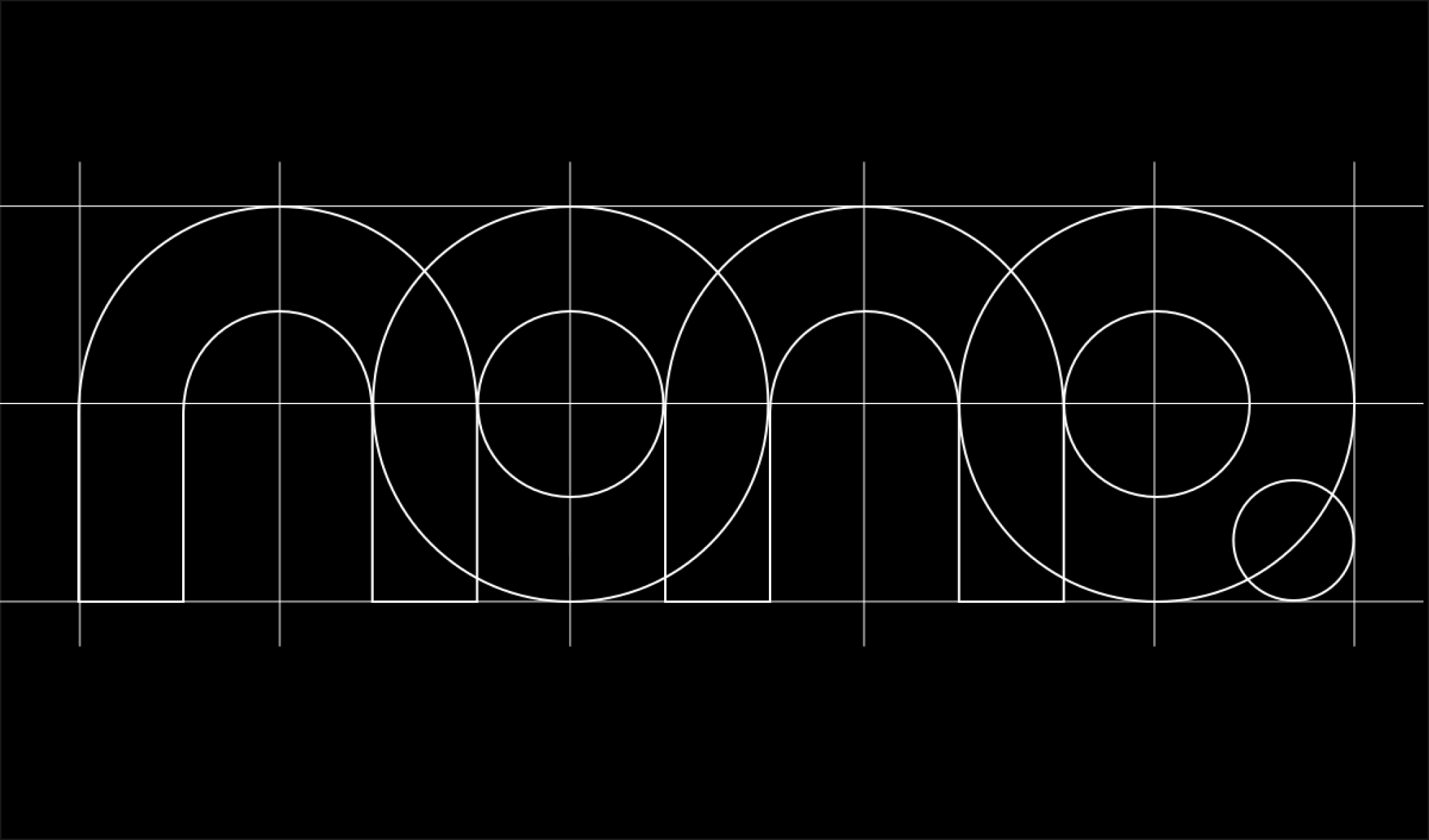
Construction
Mono is a tribute to focusing on one thing at the time. Mono-focus, mono-space. Doing less, but better. Its construction was inspired by mono-spaced typography.
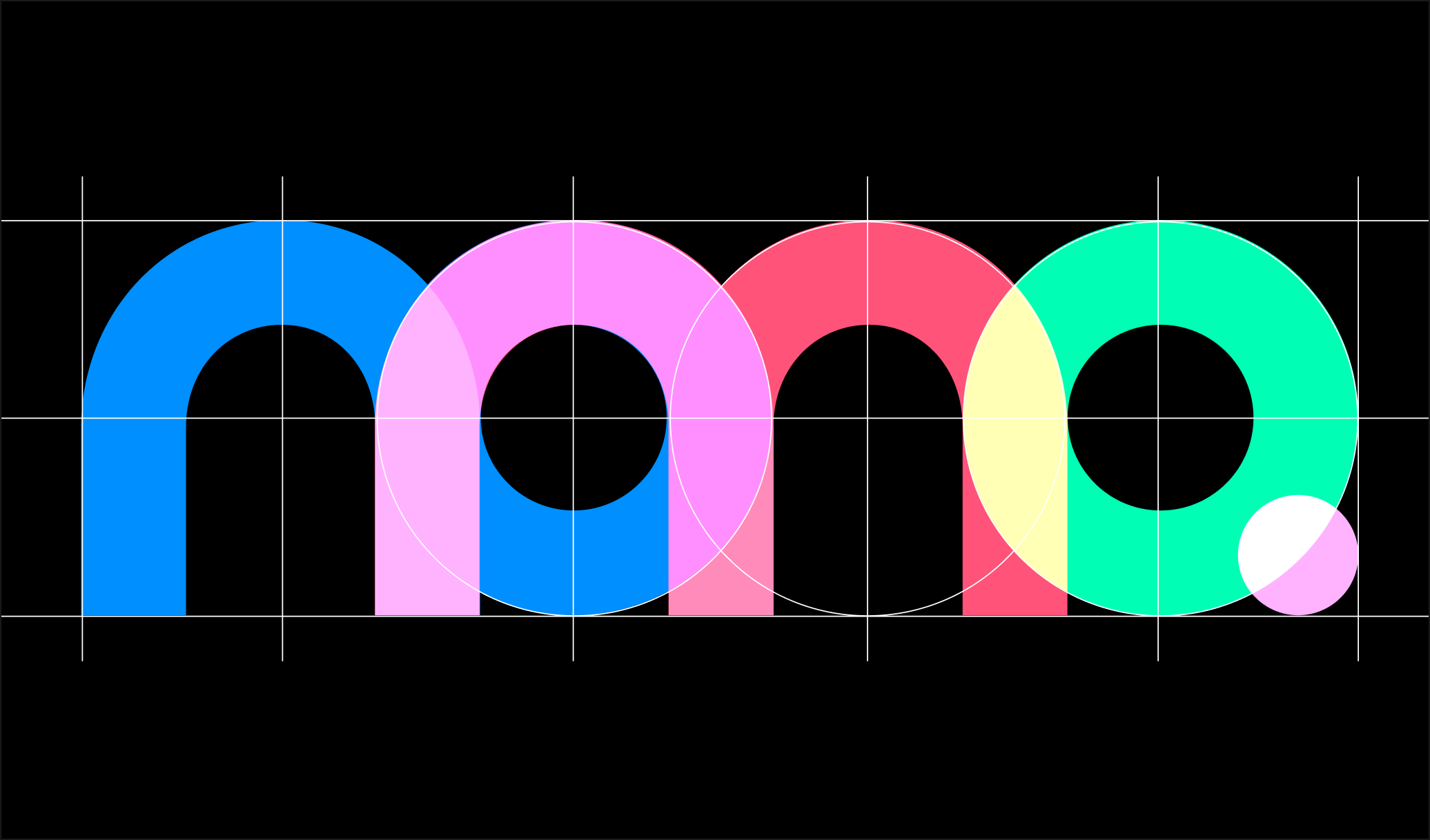
Colors
While mono sounds sturdy, it doesn't have to be. Bright, vibrant colors communicate the diversity of individuals on the team, while at same time feeling like an extension of the Google logo family.
-
mono blue
- RGB — 0 143 255
- CMYK — 100 44 0 0
- HEX — #008FFF
-
mono red
- RGB — 255 255 255
- CMYK — 255 83 122
- HEX — #FF537A
-
mono yellow
- RGB — 255 255 181
- CMYK — 0 0 29 0
- HEX — #FFFFB5
-
mono green
- RGB — 0 255 181
- CMYK — 100 0 29 0
- HEX — #00FFB5

Characters
The combination and re-composition of individual shapes allows to create characters for each member on the team. Distinctive motion conveys everyone's individual personality.
-
 @melanie
-
 @vilem
-
 @tomas
Motion
Playful animation is about paying attention to details, while at the same time letting users know what working together could feel like. At one point the animation goes backwards, because ultimately that’s what good design is all about. An insistence to improve, go back, and iterate.


This will be updated when new characters get added. Have thoughts or feedback? Reach out over email or twitter.