Everyone loves using simple and beautiful stuff. More often than not, we find ourselves pixel-fucking and obsessing about little details. We love the notion of “no user interface is the best user interface” and tend to forget that less interface doesn’t necessarily equate to better experience.
Let’s face it. We are addicted to simplicity. A simple and reduced interface communicates sophistication, hard work, a content first strategy, and a bunch of other nice sounding terms we’ve come across recently. We strive for simplicity as it seems to become the maxim of our profession.
It’s not surprising. Simple looks nice, friendly and elegant. In fact, studies in behavioral science show how strongly influenced we are by aesthetics when using digital products. People prefer using a beautiful product with a worse usability over an uglier looking one with great usability 1. Not only does this explain why advertising agencies still win a fair amount of pitches against specialized web and UX agencies, but also why we feel inclined to compromise ease of use for the sake of aesthetics.
To be fair, we are in a much better frame of mind today than a few years ago. Around 2006, people were crazy about making things look sexy, whereas today it seems – simple is the new sexy. When we look at designs on dribbble, behance and many recently launched websites, we start to see a pattern though.
Oversimplification
Oversimplified, reduced, cut down interfaces! We look at these comps and something magical happens. Our brain starts filling in the gaps.
Remember the first Alien movie? The main reason it’s so intense isn’t because aliens are scary. It’s because you never actually get to fully see the creature from outer space. Not revealing everything amplifies one of our strongest abilities – imagination! The less we know, the more we imagine. The same applies to looking at static comps. Our imagination takes over and we start dreaming about how this user interface will finally help us overcome all of our problems. Once we get to use these products, it becomes a whole different story though. It’s just like looking in a magician’s toolbox; once we know how it works, the magic is gone.
Why is this happening?
The answer is pretty straightforward. The real user experience and information architectural challenges haven’t been solved. They’ve been swept under the rug. It’s deceptively simple.
Luke Wroblewski recently spoke at Google about his popular poll-creating app called Polar. The app displays two different possible answers side by side and users get to choose which one they like better. As iOS 8 hit the market, Luke was looking forward to getting rid of the ugly looking segmented UI control and take advantage of the new, simpler looking Toggle Menu. To his surprise, the engagement rate dropped significantly as he implemented the change.
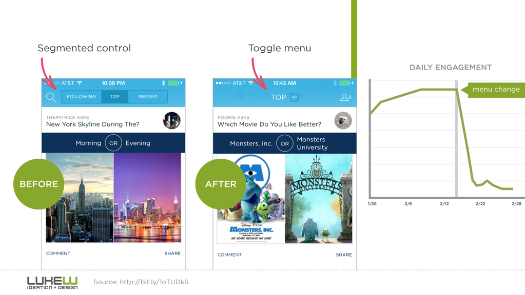
Unlike most people in the business, Luke measures engagement rate. As he realized that engagement rates dropped significantly, he immediately changed it back to segmented UI controls.
Similarly to the infamous hamburger icon, the toggle menu hides primary actions and forces users to reveal content. It looks simple but fails to communicate the primary intent of an application. This doesn’t necessarily mean that this UI pattern is bad though, it’s simply not the right tool for the job.
Look at the redesigned Adobe.com site. Put some nice big photos on your website, reduce the number of navigation items and voilà – you pretty much have the perfect recipe for modern looking, award winning web design.
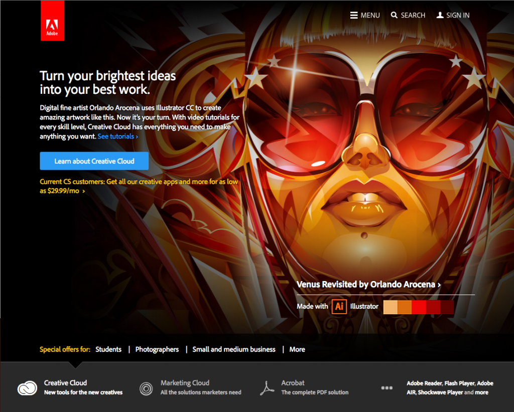
In the case of Adobe, reducing and cutting out navigation options might work, since they’re well known and have a clear call to action, but we cant’t assume that this works for the rest of us.
We believe in simplicity and aesthetics and boy, it sells!
Look at thegrid.io, the tool which makes websites design themselves. Its value proposition is ultimate simplicity. Want more conversions? Done! Want more followers? No problem! But what do we truly know about it? Very little. Just like in the Aliens movie, the knowledge gap makes our imagination take over. It creates an extremely powerful product even though it’s not even available yet.
Remember Facebook Paper? We looked at the videos. We told our friends. We were all blown away. As we started to use it, we began wondering what the primary purpose of the app actually was. It looked beautiful, felt nice and elegant but its lack of essence ultimately disappointed most of its users.
Last year we saw ello shoot through the charts. After all, its interface looks very impressive…
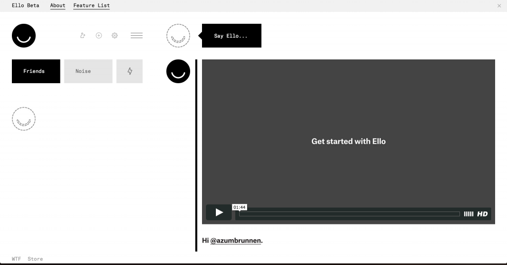
… and simple. But just because an interface looks as simple as iA Writer doesn’t mean it is. In an attempt to create a friendly and easy looking interface, they cut away stuff until there were only some conspicuous looking buttons left, which in turn makes the user interface fail to communicate what ello is actually about.
Fazit
Simplicity is so alluring and captivating that many of us find ourselves in the process of architecting lies. We change our mode of thinking from improving ease of use to stripping away UI, from thinking about the user to thinking about the looks and during this whole process we fall for the traps we thought we had overcome a long time ago.
To create better experiences, we need to force ourselves to constantly think about the purpose of a user interface. Why do people use it? What’s the primary goal of this whole app and how can we make this experience as fluent as possible. As long as we always have the right answers to these questions, we realize that less interface doesn’t mean cutting away UI, but enhancing flow, which in turn reduces the UI’s effective visibility.