Should designers learn how to code? If you feel like you want to stop reading right now, I don’t blame you. We have stumbled upon this question so many times that it has become as obnoxious as listening to a designer rambling about the difference between UX and UI.
No matter what the answer is (the answer is yes for god’s sake), basic understanding of code never hurt. And that’s where Framer came in.
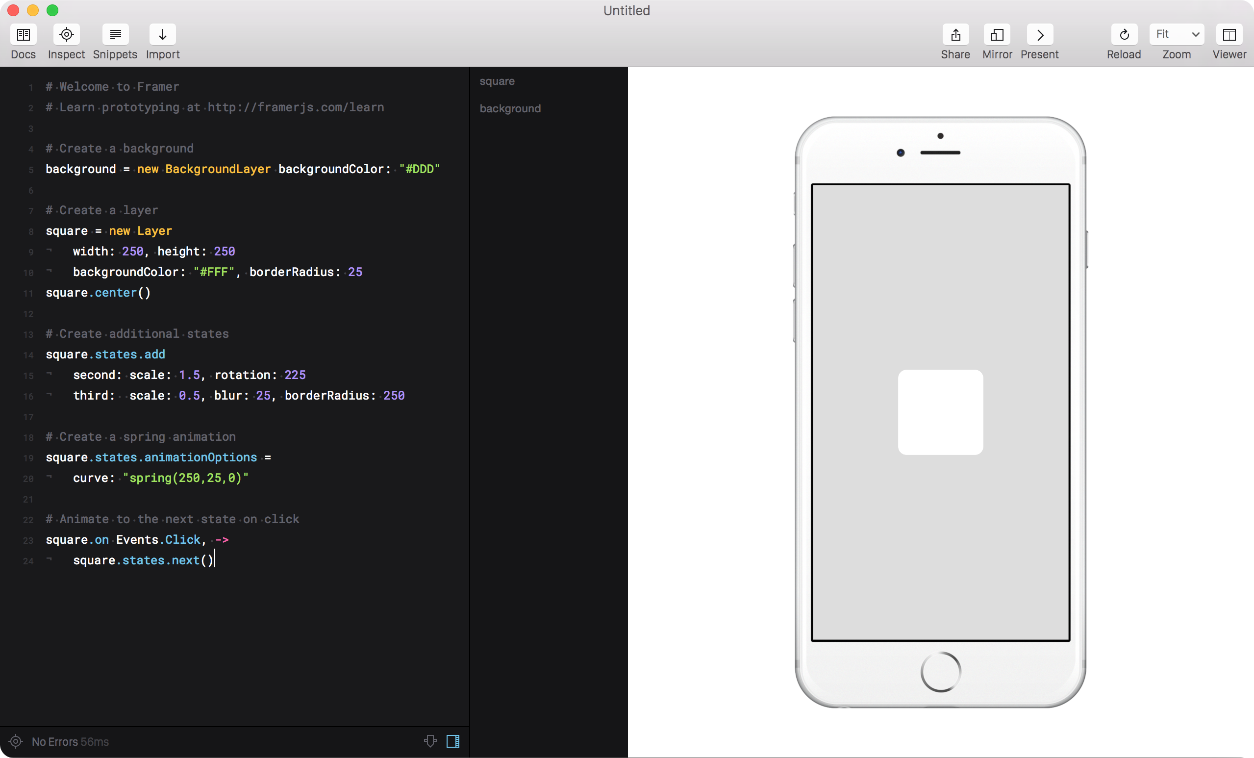
Framer filled a gap that no other prototyping tool had offered at the time. It gave us the messiness and familiarity of web technologies and code, combined with the simplicity of importing from Sketch. Any static mock could come to life in no time.

When I played with Framer for the first time, it was love at first sight. Its sophisticated physics engine to simulate native behavior, the split view that displays code and visual output in real time, and the seamless import to instantly get started. All the above turned Framer into my prototyping tool of choice.
Whereas click-dummy prototypes felt like zapping through a clunky piece of presentation software, Framer’s code-based architecture offered a way to go beyond screens and micro-interactions. Some crude logic was enough to make the difference between something that felt dumb, and something that felt like an actual product.
Web technologies have always been a hot mess. Since its early days, JavaScript has been criticized for being incomplete, messy, and unstructured. That didn’t stop it from becoming one of the world’s most used programming languages. History going all the way back to the invention of the compiler shows that ease of use and accessibility predictably trumps efficiency.
Unlike the soul-crushing experience of writing your first line of code in Java, JavaScript is way more forgiving. There isn’t a red console warning reminding you of your own incompetence before you even had a chance to finish typing your line of code.
Our inherent tendency is to get rid of messiness and tidy things up. We go to great lengths to eradicate inefficiencies. We aspire to make everything modular. We constantly worry about the future and find solace by obsessing about scalability.
While messiness is problematic in a production environment, it invites creativity and a problem-solving mindset during early stages when a product aspires to find out what it wants to be.
Choosing the right tool for the right stage of the product design life cycle matters.
The rise of Framer X
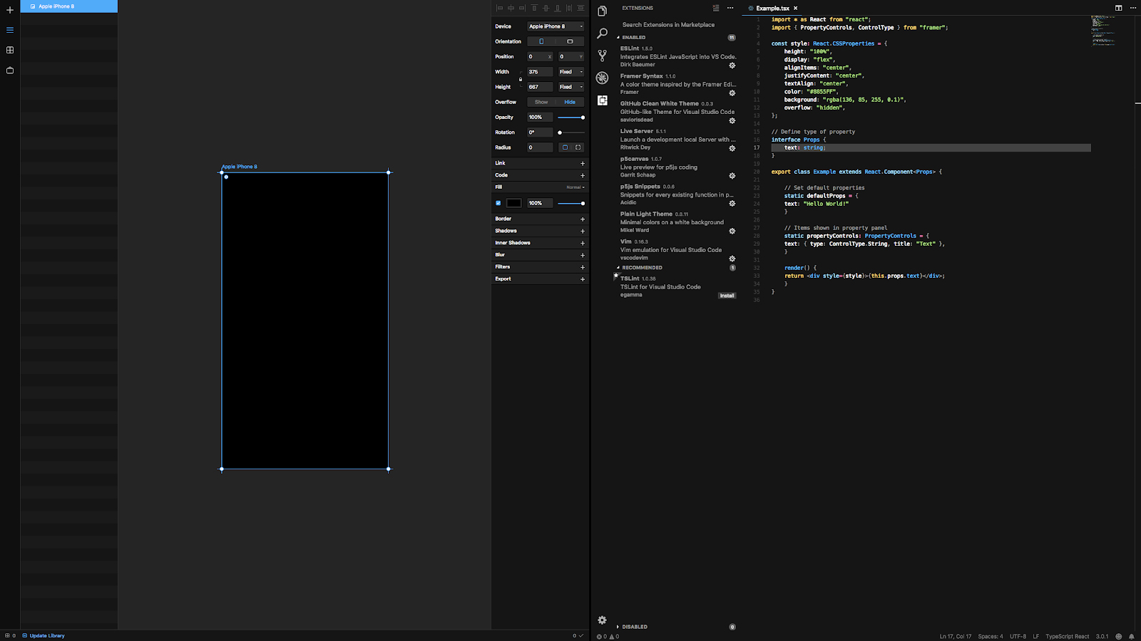
The introduction of Framer X marked a critical milestone that altered the underlying formula of the product. While Framer X was built on top of the building blocks that had turned the original Framer into a major tool in our industry, it also put a stronger emphasis on code structure, scalability, and modularity. As a result, the lines between an IDE and a prototyping tool became blurred, and so did the promise of Framer as a whole.

In Framer Classic, code was a clear means to an end, never an end in itself. It astutely used CoffeeScript, which to a rookie, looks a lot like a dummy version of JavaScript. Framer X abandoned this philosophy and opted for more sophisticated ways of writing code. The introduction of React was both a super power and a curse in disguise.
Framer X felt like it attempted to convert every designer into a UX engineer. Like a prophet shouting from the top of a mountain, it unanimously answered the question that has kept our community pondering for so long: yes designers should learn how to code. And while they are at it, they should read the fucking manual that comes with React.js, JSX, and TypeScript.
The challenge of any UX engineer I’ve worked with is their temptation to over-index on the quality of the code, instead of the quality of their ideas. Tools affect our ideas, and ideas affect the tools we build.
Framer X alienated designers who are afraid of programming while simultaneously increasing UX engineers’ fallacy of over-indexing on code.
Most of us didn’t want a new IDE. We didn’t need a new code editor either. What we were looking for is the perfect hot mess that the initial Framer was. A way to go beyond visual prototyping. A tool built on the foundational ideas of Bret Victor’s famous “inventing on principle“. A magical fusion of messy code combined with the speed of its click-through competitors.
Framer X might find its new niche as it now adheres to code-savyy designers and UX engineers. The product decisions that led to Framer X fundamentally altered the soul and essence of a tool I used to love. Framer used to be about playing around. Now it’s a about building things.
What remains is the legacy of its name and the nostalgia of the users it once had.
RIP Framer.
