
Have you ever heard of the song “Gangnam Style” by Korean music artist PSY? Yes you have. Did you go all crazy when it was played in your favorite club? Possibly. Do you still listen to it or sing it in the shower? Probably not. I don’t know of a single Swiss radio station that still plays this song. Now people’s reaction is like “Ahhh. That crazy Korean song from 2012… Again!”
I believe there are some interesting lessons about the ephemerality of trends and design which can help us to understand how perception changes and what impact it has on visual communication.
Designing for change
When I was at the Adobe Digital Marketing Days in Zurich, Dietmar Dahmen from ecx.io presented some interesting facts about changes happening in society that affect our everyday lives. One of the key insights was that we get in touch with new products and advertisements faster than ever before.
In 2013 we are confronted by an average of 5'000 ad messages per day (source). Products and services are updated much faster. Technically speaking, the iPhone 3 might not be the most recent phone there is, but the unprecedented growth of technology and in particular the incredibly fast growing smartphone market make us perceive the phone as older than it actually is.
First we invent technology, then this technology reinvents us.
Technological revolutions like the first computer, the walkman, the iPod and the iPhone didn’t just change the way we use and think about technology. They completely changed the way we embrace it in our daily lives. This socio-cultural change goes far beyond technology though. It makes trends and all of our surroundings become much more short-lived experiences. What we perceive as good today, might already be shitty by tomorrow. Something similar happened to “Gangnam Style”.
Gangnam Design?
So what is Gangnam Design? Recently I was looking for some inspiration on contemporary web design. I browsed some websites and was surprised that so many still elevate fancy, sometimes even crappy graphical design over user experience & accessibility. I encountered sites that…
- had insane parallax-scrolling (different layers moving at a different pace to create the illusion of depth) at the cost of responsiveness
- had overwritten the default back / forward behavior of browser in unreasonable ways
- used iOS toggle switches
- used the iconic mobile hamburger button on desktop UIs to represent the main navigation
- had extremely slow loading animated video backgrounds
- misused CSS3 features just to show off
- had modal pop-ups filling the whole screen which made me want to restart my browser (thanks to @crazyxhtml)
- …
There are tons of such design examples that make me want to go Rambo. A crazy parallax-scrolling website without any responsiveness and bad accessibility is like a Korean guy sitting on a toilet in a video clip. Sure, it is funny and pretty impressive the first time you see it, but ultimately you will barely notice it anymore and at worst you’d wish you had never seen it. All those short-lived design trends lacking any notable benefit can be summed up as Gangnam Design.
Now I'm not saying we shouldn't use new technologies to build next generation experiences for people, but we should thoroughly think through the consequences and not just use them for the sake of being cool and trendy. Instead I challenge you to ask yourself:
“Is this [ insert fancy feature here ] really important for the final design? Will it distract the user unnecessarily from the content or will it enhance the experience while using your site?”
Some examples
The Boy-Coy Website
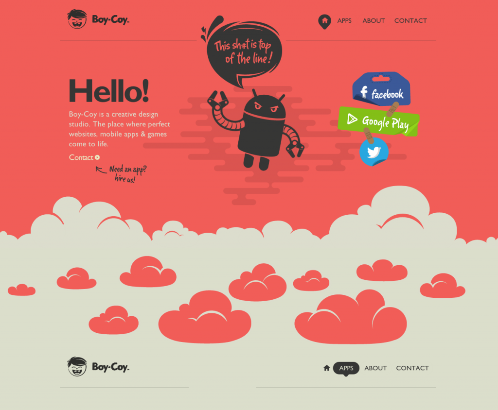
The website of boy-coy a creative design studio focusing on mobile apps & game development is a good example of this. (There are tons of websites like this, they just showed up first in Search) Their website is very fancy and they did a remarkable job on using parallax-scrolling. As games use this kind of technique a lot it perfectly makes sense for a game developer studio to make use of such an effect. Nevertheless, it is questionable if it really pays off considering how many people access the web on mobile nowadays. When scrolling the website you will also see that the UX breaks completely because the browser’s back-forward functionality is overwritten while scrolling.
We are empire

Another good example is the website of We Are Empire. They use the hamburger mobile button as their main navigation icon. While the hamburger has somehow proven to work on mobile devices, it is risky to use it on desktop, especially for representing the main navigation. The idea of responsive design is to harness the characteristics and advantages of each individual device type, to deliver the best possible experience. So why hide the main navigation when there is enough space available in the first place? I know the hamburger icon looks cool but the UX will completely break if the user doesn’t grasp the conceptual meaning of it. Concepts like this should thus be used with care.
Edit: They updated their site. No hamburger anymore on desktop version. Huraaayy!
VW Website
Then we have animated video backgrounds. Lots of websites make use of this technique nowadays. It might even get you an award. My advice is, don’t design for awards, design for the user instead. What’s the point of having an animated video background that loads extremely slow and drains the battery of people’s mobile device? Tons of news issues coming up as well. If you use this technique, make sure you use it reasonably.
Avoiding Gangnam Design
There are many more bad examples to discuss but you can use this as a guideline:
The more fancy & trendy stuff you add to your design, the higher the chance you are doing Gangnam Design.
Design trends, new technologies and evolving interaction principles have a very strong connotation in the time they become available. Sustainable and longer lasting design happens when we critically ask ourselves whether this new thing really enables the communication and accessibility of contents, or if it is just for the sake of a temporary “wow” at the cost of accessibility.
In my next post I want to highlight the principle of designing for simplicity and how simple design can strike & amaze us and perhaps even make us better humans.
Stay tuned & thanks for the ride! If you liked this article, you can follow me on twitter.