There is probably no other UI element on the web that has witnessed such an intense and successful career as our well beloved friend: the hamburger button.
Since it’s first appearance in the official Facebook app, it looks like the hamburger, or mobile icon, is about to claim the title of King of Menus and Ruler of Responsive and Mobile Design Patterns.
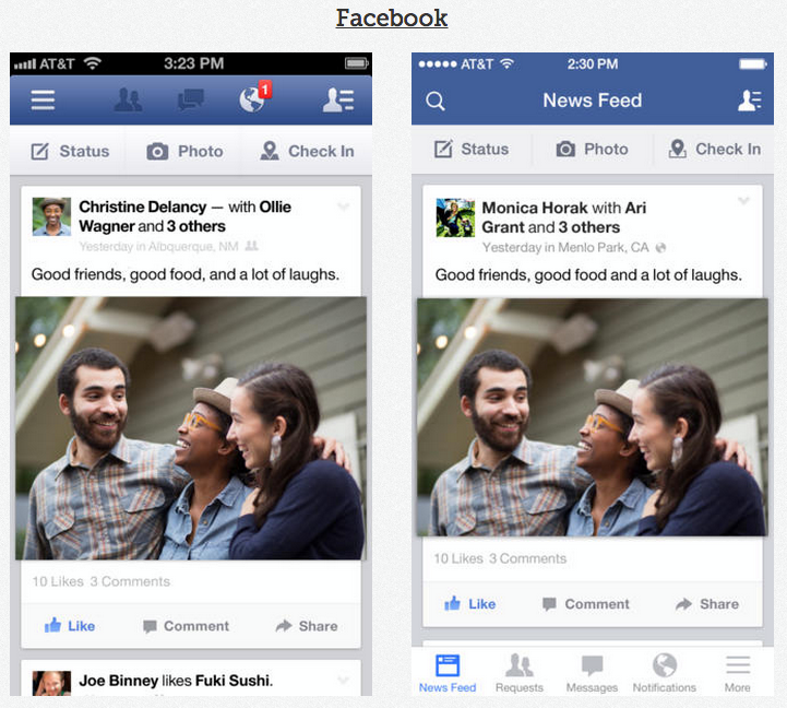
There is something alluring about its simple look isn’t there? We cherish the idea of simplicity, but when it comes to designing interfaces, striving for visual simplicity sadly, isn’t enough.
But I’m not here to tell you why it doesn’t work. There are enough people who did this already:
- Kill the Hamburger Button
- The Hamburger Icon
- Why And How To Avoid Hamburger Menus
- Hamburger is bad
- etc…
Now don’t get me wrong, I believe they all made some good points. Using the mobile icon simply because you’re too lazy to come up with a decent information architecture is a strategy destined to fail.
But we shouldn’t forget the reason this pattern actually became so popular in the first place.
First, there is the obvious lack of mobile screen estate. Showing a tab-bar might work well for apps to switch between different contexts, but sorry, in most cases it won’t provide enough space for a page navigation. Second, navigation menus often remain untouched by visitors. Information architecture is shifting from the traditional top-down to a more content driven bottom-up approach. People don’t start their journey from the index / welcome page anymore. Instead, they dive in via search engines, somewhere deep down the rabbit hole and the only thing that matters as this point is information.
An attempt to improve the mobile icon
It’s pretty safe to assume that this guy will stick around on our screens for some more time. So instead of sounding like a jerk talking about the pros and cons of the mobile icon, I’d rather discuss potential improvements in the context of website navigation.
When we created the new Holtzbrinck.com, one of the world’s leading media companies, we had to reduce all the existing information to one single page. Readability was key, but we also realized that the page became far to long to browse on a small screen. We needed to provide users a means to navigate at all times. A Tab-bar like menu would have been far too intrusive, even if we had applied the “scroll up and show” pattern. Instead of using the classic sticky navigation bar on top, we decided to implement a different behavior.
As soon as the user starts scrolling, the only thing fixed to the viewport is the mobile icon itself. By flushing it to the right, we make sure, that it isn’t interfering with the reading experience.
This seems to work pretty well; but I think we can go even a step further.
An improved pattern for the web
From the discipline of iconography, we learned one thing for sure: People don’t get most icons. For example, studies clearly show that people don’t understand iconography in cars:
Icons rarely communicate an action in a clear and concise way. Why should it magically work for the mobile icon then? Exis web conducted a study in which they found out that the word “Menu” works much better than the hamburger. Fair enough, so how about we use both?
We know from the theory of gestalt principles, more specifically the proximity principle, that objects which are positioned near each other, are perceived as a group. So why not provide initial context by using this principle, and then fade out the “Menu” label as the user starts scrolling?
By showing / hiding the labels during scroll, we can make sure that the user gets a chance to learn the icons associated action. We could even fade in the label once the user scrolls up again.
Of course there are many possible variations for this.Let me know about your thoughts on twitter.
Edit:
Various discussions on Twitter helped me to come up with some further improvements. To avoid the illusion of motion while scrolling, we have two options: We can either set more padding right to avoid overflowing of content or we can specify a solid background.