When I started my job at the advertising agency two years ago, people’s expectations were high. They did not have an online team yet and I was supposed to help them getting their hands on web & social media.
I’m sure you have seen at least a dozen of agencies claiming they offer professional web design. I’m sure they are the great developers and possibly even great print designers but are they really web designers? The problem most advertising agencies are facing is credibility. What’s the point of working in the advertising business and having a website that looks like a mortgage contract? Unless it’s a really fancy mortgage contract – probably none. Fortunately the CEO got it and we were all set.
Information architecture
It was no rocket science to figure that there was just way too much information that couldn’t possibly be of any value for the visitor. I conducted interviews with employees in the agency, and asked them what would make them choose one agency over another. The answers had a clear tendency towards creativity and experience. The challenge was to incorporate those values in the eventual design.
Designing for conviction
Designing for conviction forces you to ask yourself the following question: what’s the most transparent and authentic way to convince people that you actually know what you are doing? There are many who can talk but only a handful of people can deliver as they claim. After all, the work and stuff you make is probably your most authentic and valuable asset.
Aren’t you tired of all the ad agencies talking about their models and their procedures, then ultimately just working like most of the others in the industry? I won’t say there aren’t any agencies who have great ways of dealing with their clients and producing stunning work, but most of them just sweet talk people into some crap that has barely anything to do with reality.
The most credible asset of an agency is its work. It was therefore an obvious decision to show work in the above the fold area. We ended up removing half of the navigation items and the amount of content was significantly reduced. No one ever missed any of the old contents ever since.
News Section
Have you ever heard someone say «you never get a second chance to make a first impression?». You probably have and even though it’s an old expression it still applies. Designing for conviction means to have your users in mind and to get your message across in the most convincing way. CEO’s often want their own news section on the page. It is reasonable as long as you don’t know that only an average of 1% of visitors read news sections. Knowing this can be really handy if you need to convince someone not to give the news section too much priority / visibility. Nevertheless, they insisted to have a news section but argued that it doesn’t have to be the first content block. Unfortunately, a news section is a learned behavior. Users expect it to be on top but I knew this would ruin the highly visual introduction, the kind of introduction an agency deserves.
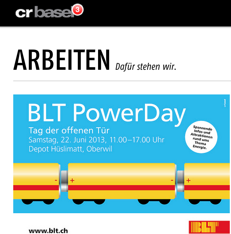
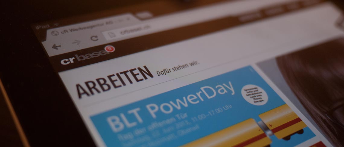
I started looking at other platforms for learned user patterns that solve a similar problem. I proposed a news section that was both, satisfactory for all the involved users and stakeholders. It’s basically the same principle as with iMessages on iPhone. I displays the number of new items the user hasn’t looked at yet. This solution has proven to be really powerful and they got some great feedback from customers by mail.

Typography
The agency had it’s own design team and I was really excited that they offered me the opportunity to make a design suggestion. I worked closely with Daniel Roth, a talented young designer and we had to convince the board and the design team of our visual design. Among others, typography was one of the most delicate topics. Erik Spiekermann wrote in his Book:
Type says much more about a news-paper than just the words it spells.
Typography is more than just a representation of letters. Typography tells a story. Every typographer has his own unique style and expresses something with his creation. It isn’t enough to just choose a typeface that looks nice, it’s about finding a harmonic bonding between the intended message of the typographer, the contents, and your company.
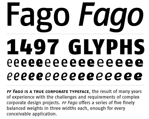
At the time of writing, crbasel has been in the advertising business for over 44 years. The agency was thus at the same time a classic agency but also modern enough to start an online communication division. I eventually found a typeface which reflected those qualities in a very suitable and concise way. It’s Fago from German type designer Olé Schäfer. It’s a modern classic font, very robust with lots of different sizes and styles. The graphic designers accepted our suggestion and became the official corporate font.

Responsive Design & Outlook
In a time where people access websites on such an immense variety of devices, everything has changed. It isn’t enough for websites to look good and scale for the screen anymore. They need to be understood. For instance UX tests show that the use of native drop downs are almost always a bad idea for representing navigations (read here).
If you have seen Jiro’s dreams of sushi, a documentary about an 85 years old Japanese sushi master, you might recall the scene when he tells the viewer:
Just when you think you know it all, you realize that you’re just fooling yourself.
At the time, I thought I had a pretty neat solution. I was fooling myself. Today I would approach many things differently. Among others, choosing a type with better rendering performance on windows machines.
There is alway room for improvement. The only question is how far we’re willing to go.
