In my last post I wrote about the odds of using fancy design compromising the user experience of web sites. After some discussions in the comments and twitter, some people apparently think that I’m advocating simple and thus boring design. Now here’s the thing: simple does not mean boring. In fact, simplicity can strike and even amaze us.
Let me share an epic story with you. A story that illustrates the power of simplicity:
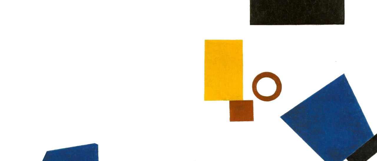
When George Lois – a world famous advertiser who was an inspiration for AMC’s show Mad Men — was 14, he had a vision. In the early 20’s, Kazimir Malevich’s work led the future of modern art on a more abstract level. His images were mainly composed of abstract geometrical shapes as seen on the following illustration:

Kazimir Malevic Work
When George attended High School of Music & Art in Manhatten, he was asked to create similar compositions based on Kazimir Malevich’s work. The more he and his classmates ripped off a Malevich, the more his teacher liked it. In the final exam, they were asked to draw another illustration using only rectangles on an art board. All of his 26 classmates worked furiously while he was sitting there motionless. When his teacher was about to grab his board, he quickly added his signature to it and signed: G.Lois.Boom.
It was at this very moment when George realized he’d created the ultimate rectangle. This example of utter simplicity shows us one thing: Coming up with creative solutions that look completely obvious and simple isn’t easy; but the result is striking.
Now what can we designers learn from this? Paul Rand, best known for his logo design for IBM, UPS and Steve Jobs’s NeXT, once said:
Good Design is simple, that’s why it is so complicated.
So much truth in such a short statement. You can only design simple stuff by fully understanding the problem at hand. While art can be interpreted, design always solves a problem; whether it’s meeting business goals or having a self-explanatory UI etc.
A fancy design doesn’t have to be unusable
A design is said to be good when it communicates contents in an effective way and matches the tone of it’s content. If you are a graphic designer, a game developer, a creative studio, an artist or any other kind of individual who aspires at fancy stuff: Go for it!
It’s totally fine to have a fancy, fashionable and crazy website. Having some of these traits can even enhance the integrity and credibility of your content. But guess what? That still doesn’t mean that people should be screwing up the user experience at the cost of fanciness.
Usability remains a key aspect of user experience. Parallax scrolling and other sweet stuff discussed in my last post have the potential to communicate creativity and innovation. Doing so at the cost of usability is certainly not aligned with business goals though. Even worse: it could be an indication that you don’t understand your audiences`s need. What’s a web designs value that looks fancy when you can’t even accomplish the easiest thing like finding contact information? Unless it’s a completely story-based website: probably none.
Effects as a means of spicing up your app / site
“Animations and other visual effects do not add any value to your design, they are completely useless”. A claim like that would of course be very naive… Let’s see why.
Animations and transitions of states can actually have a profound effect on users` understanding of the way things work. Pasquale D’Silva wrote about the use of effects in his popular post transitional interfaces:
Animations can be used functionally and they leverage an overlooked dimension — time! […] Animation can help to provide context. It helps brains understand how information flows.
I’m a big fan of transitions and animations because they can make an interface feel more natural and responsive. As animations can even enhance a users` conceptual understanding of a product, they have become a fundamental asset we need to take into account in our design thinking.
Examples
Let’s quickly have a look at some examples:
Carsonified.com
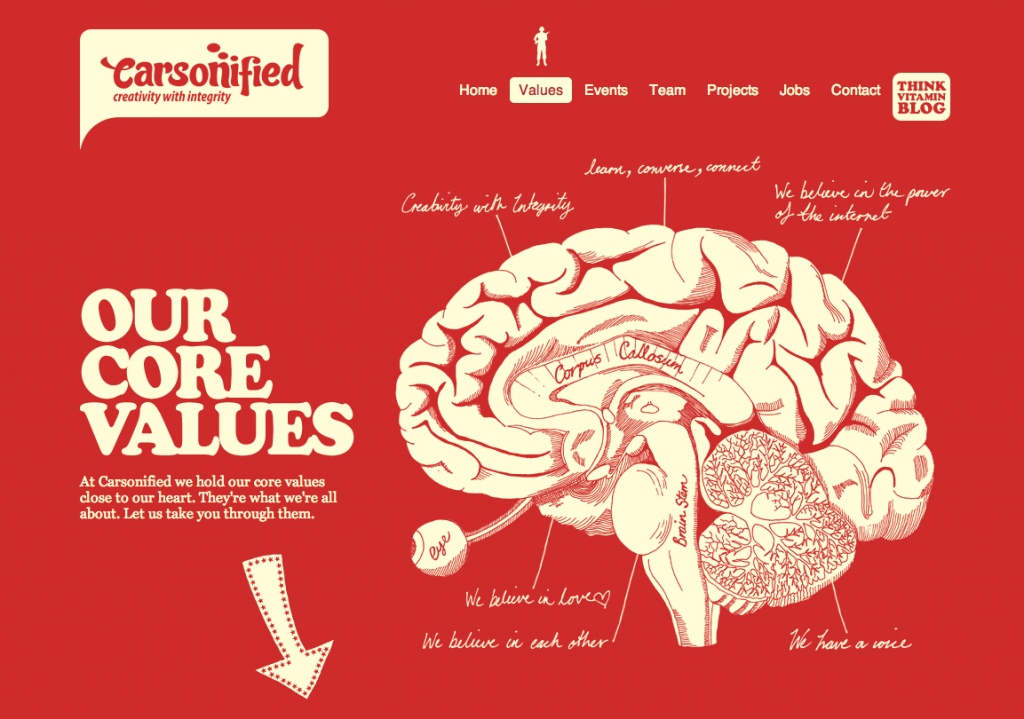
Carsonifieds` old values page
The old Carsonified values page is a good example of fancy design done well. While the website looks very unusual because of its illustrations, it remains simple and accessible.
Firefox OS Website
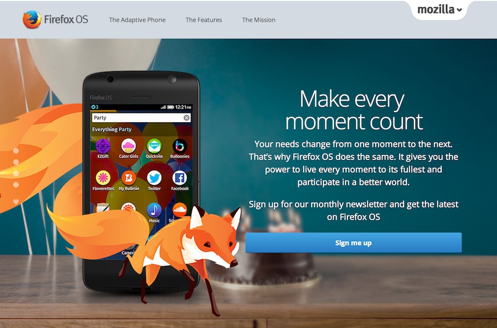
Firefox OS Product Website
While certainly pushed to the limit, the Firefox OS website still does an excellent job leveraging smooth JavaScript and CSS transitions while maintaining both responsiveness and usability. If you disable JS, the site continues to work perfectly. In fact it would be extremely useful if you could disable the storytelling mode, as it might be a little overwhelming for some users.
Countdone App
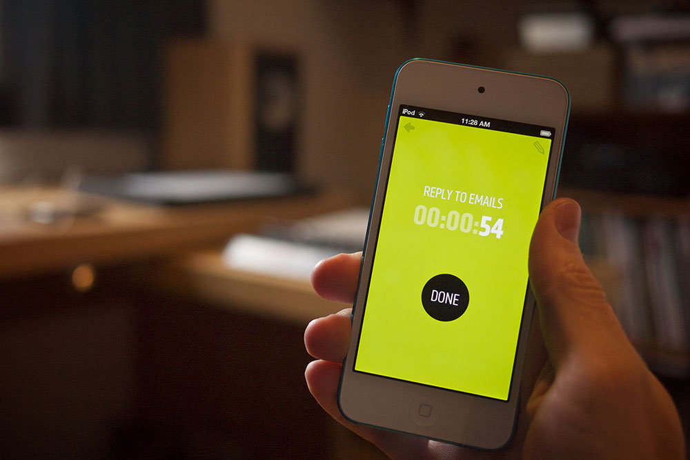
Countdone App by Elliot Jay Stocks
A small App by Elliot Jay Stocks that allows you to have your to do’s in a more epic way. What I love about the app is that the background color slowly transitions to red the closer you are to the deadline. It’s not just an embellishment, it’s a highly functional use of color that gives the user some quick orientation. Go checkout the video.
Crbasel Advertising Inc.
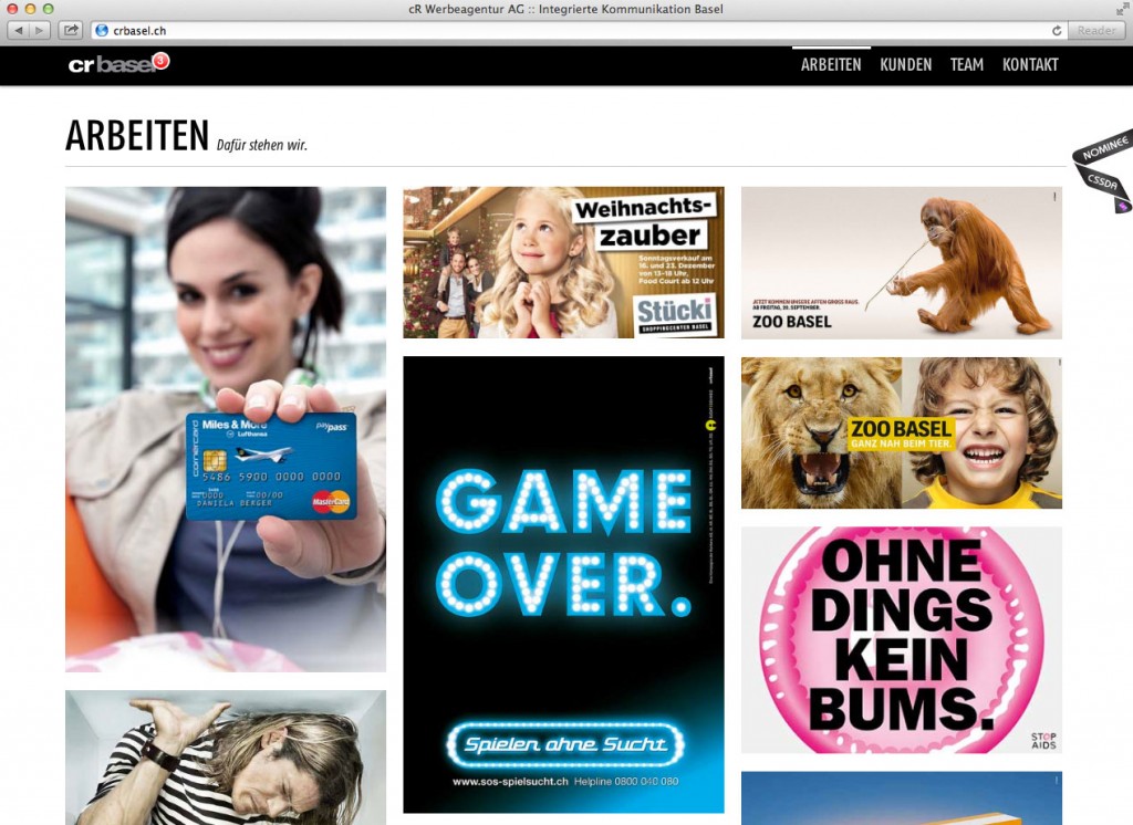
crbasel advertising
Another example is this website I made for an advertising agency. When you click on a navigation item, the site scrolls you to the specific area within the site. It’s a simple example of highly functional animations, because the user sees what he is potentially missing out while navigating.
Conclusion
There are times when simple design can look fancy. But as design is much more than just a mere visual representation of something, the sum of it can still feel simple and awesome at the same time.