
Everyone likes buttons. They are an essential part of a user interface, whether it’s in a physical product or in the digital realm. Apple put a lot of effort in creating beautiful buttons, or as Steve Jobs once said it: “We made the buttons on the screen look so good you’ll want to lick them.”
We spend a lot of time making buttons look more appealing. The way they look changed quite a bit since their first appearance:
With better performance, dedicated graphic memory, displays with thousands and millions of colors, a new generation of graphical user interfaces have emerged. A less drastic but also notable evolution took place on the web. With web 2.0 bringing us the most colorful, shiny, and expressive buttons, featuring gradients, shadows, bold borders and all kind of interesting shapes.
After a while, they evolved further when CSS3 became available.
Until, eventually, they were replaced with text.
What an uninviting and boring button! Gone are the days of gradients, shapes, bevels, drop shadows etc. While you might not miss these kind of buttons, simply replacing them with text isn’t a flawless solution.
The issues of text buttons
There are lots of resources available on button design, whether it’s for optimising conversions or use within applications in general. Creating effective buttons is still an art in itself. Let’s have a look at some issues of text buttons.
Contrast
Text buttons don’t provide as much contrast as the good old graphical button did. They often do a poor job of providing affordance as well.
States
States are an important concept in button design. You don’t want to make your users guess whether a button is active or disabled etc. Working solely with text color raises new problems. For instance color blind people get confused easily (trust me, I am color blind). Colors in larger areas are much easier to discern.
Background issues
Depending on the background, text buttons work less well than traditional buttons. A button usually provides a background. This makes it more flexible and easier to get a consistent application of the button design across a web site.
Prioritization
In button design 101, we learned that secondary or tertiary actions can be formatted as text links instead of buttons. This further emphasizes the primary action. Such a clear differentiation is harder to achieve when solely relying on type.
Click areas
Buttons have a much more recognizable area. With text buttons, you either reserve space, set font size really big, or make the user guess where to click.
Am I saying that we should bring back Web 2.0 buttons? Ehm… no! But we should still think about how we can create better buttons in an era of “flatter” design.
Creating simple, understandable buttons
Creating simple buttons starts with the most essential ingredient of all: text.
Text
Even though studies show that people do not understand iconography, designers keep creating buttons without text. Make no mistake, text is the most essential part of a button. So make sure users understand what’s happening if they press it.
The only exceptions are learned buttons with a strong association of their function. Buttons like undo, redo, bold, italic, etc. don’t necessarily need text.
Smart use of iconography
Text usually doesn’t suffice. When working with text-only buttons, icons do a great job at guiding users’ eye. They ease communication of states and help make buttons recognizable.
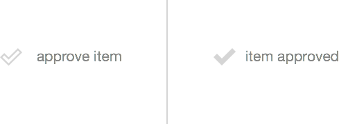
Icons can provide visual affordance on what’s going to happen next:
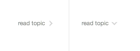
The simple change of an icon can completely change a user’s expectation of a button.
Background color
Another approach to make textual buttons work better, is to put them on a different background.
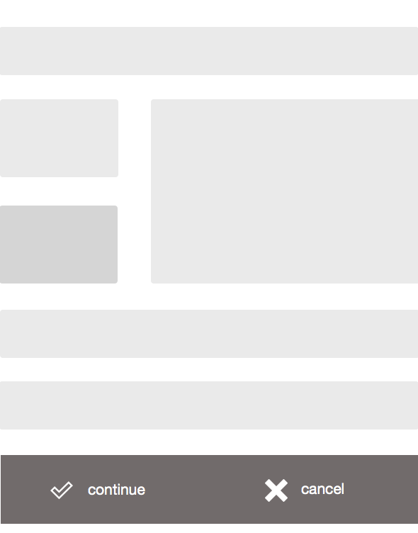
The content is on a white background and function on a gray one. This helps users to understand that there is a separation of content.
From here on, it’s up to you if want to go further down the rabbit hole or just leave the button as is.
Strokes
Strokes are a great way to separate a button from it’s surroundings and help users identify them more easily.
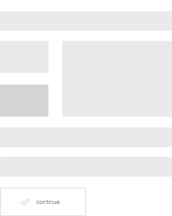
When working with strokes, it’s important to keep in mind that the stroke style should always take into account the background color of the button’s surroundings. A black stroke in dark background isn’t exactly helpful is it. So keep this in mind.
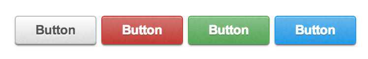
Fill color
A colored button gets a lot of attention and is perfectly suited as a call to action button. The use of different colors, if used consistently, helps to distinguish primary from secondary actions. Also make sure that you use colors that match the overall design. You might use one color that is completely different in order to make it really stand out.
Whitepsace
Creating good buttons is predominantly about making them easily discoverable by giving them enough contrast. Good contrast isn’t only achieved by the loud use of colors or size. It can also come from the smart use of whitespace.
One more thing
Relying on purely one single design approach mostly results in a sub-optimal user interface. We should rather combine techniques that have proven useful to get the best of both worlds, while keeping up an integrated look and feel. Putting a light border around text isn’t a decision about going skeuomorph, dimensional, flat or not, rather it’s a means of providing orientation through affordance and recognition.
How do you approach button design today? What’s your experience on purely text-based buttons?