
3 design take aways from Apple’s latest smartphone
I’ve been playing around with the iPhone X for a couple of days now. The one thing that surprises me the most is how different it is from all the previous models. It’s the most radical deviation from the original iPhone, and yet — or perhaps precisely because of it — the best update so far.
With it’s high price point, its iconic notch, and a full glass design, it causes a lot of controversy. The type of controversy that gets people to talk and line up at stores all around the world.
Every design has a story. And once a new design comes along, I try to understand what I can learn from it. Here are the three takeaways I’ve had.
1. Turning a constraint into a feature
2017 was all about bezel-less displays. Apple came close to its vision of a fully bezel-less screen. But let’s not fool ourselves here. The notch is a reality, and it’s here to stay for a while.
The iPhone X wasn’t the first phone to both have a notch and an almost bezel-less form factor either. But it’s definitely the first that turned it’s seemingly biggest disadvantage into one of its most distinctive features.
As designers we’re often faced with constraints. How we deal with those and the solutions we come up with can fundamentally change the way users feel about it.
Apple writes in its guidelines that developers should embrace the notch but how can you embrace a notch?
Glad you asked.
I wondered the exact same thing. While the notch removes a lot of screen estate in the upper part of the display, it also changes what the rest of the upper screen stands for. There used to be a green or blue bar for ongoing activities that took away from the immersiveness of apps by shrinking the vertical screen size. That’s no longer the case.
The corners are now used in a way that feels much more intentional, responsive, and useful.
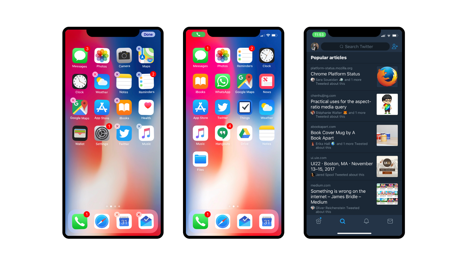
Notice how on the first screen, the right hand side area is used to confirm the arrangement of apps whereas the left side is used to indicate ongoing activities like phone calls etc.
Ongoing tasks therefore no longer shrink the screen:

It feels like the lack of screen estate results in a more focused UI. As we’re probably all painfully aware, too much space often quickly turns into a nightmare of icons and options. Or as a friend at Google once said:
The problem with menu bars is that once they exist, people will put all kinds of shit into it
Is is perfect? No. Particularly gestures like Control Center and Notifications are clearly too far away. But it’s remarkable how the notch reframed how the upper part of the screen is used.
2. Making technology human
Face ID is a remarkable technology. When I saw it in the keynote, I thought Apple did a pretty good job in telling a futuristic story about how Face ID works.
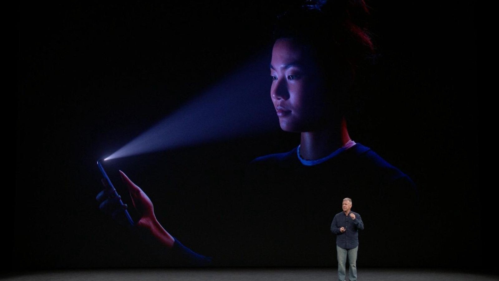
I only realized a few weeks later after watching a video from The Verge, that this is in fact, precisely how the technology works.
While Face ID is remarkable it’s also remarkably scary. I mean, this thing throws around 30’000 IR dots on our faces that can penetrate through sunglasses and yet, we’re all somehow cool with it.
Apple didn’t just use the technology to allows users to authenticate on their phones. It used the iPhone’s depth sensing camera for Animoji and Studio Portrait Mode for selfies.
Fear is an intense emotion. And like any intense emotion, the easiest way to handle it is often not to stop it, but change it. Animoji hides the technology and turns it into something that’s approachable, emotional, and ultimately human.

“You have to start with the customer experience and work your way back to technology.” — Steve Jobs
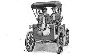
People are often scared by new technology. When previous generations encountered the very first cars or locomotive train people were petrified. They were used to seeing horses pull a carriage for their entire lives.
That gave Uriah Smith the idea to attach a full size horse head to automobiles. What sounds like a crazy idea today, wasn’t that crazy back then. It’s hard to imagine how we would have felt in the same situation more than a hundred years ago.
My takeaway here is simple. Every new technology provides a platform for innovation. But it’s our jobs to make technology human for it to find wide-spread adoption.
3. Towards a gesture driven future
FastCompany calls the iPhone X a usability nightmare. Is is it actually that bad, or is it bad because the new phone doesn’t have a horse head… erm… I mean a Home button?
I quickly showed my iPhone 6s to a friend who was interested in buying it and I was surprised: I tried closing Photos app by swiping it away. And that’s after using the iPhone X for only one single day.
Removing the Home button was a risky move. It’s arguably the biggest change to happen to the iPhone since its early day, and it seems like it paid off.
Apple replaced the Home button by introducing a new set of gestures.
The power of gestures
Gestures are a delicate topic in the UX world. They make a UI look less cluttered but that cleanliness usually comes at a high price: designers rely on users to figure out how these gestures work.

The fact that Apple made this move tells me a larger story here though. After 10 years of smartphones, proficiency of users has evolved just as much as the phones themselves.
We went from elevated buttons to flat ones. From leather panels to gray panes, from buttons to labels, from labels to icons, and back. We survived the Skeuormophic era of design and happily keep hammering on buttons that look a little less like their real world counterparts they used to imitate.
This liberation from the analog world moves the craft of digital design towards a more fluid model where animation and gestures nicely complement and inform each other.
Now that gestures have become an essential part of the core interaction of an operating system that’s used by millions, we can expect to see much interactions like these in the future.
Gestures aren’t easy to get right though. As we’ve seen, even Evan Spiegel, CEO of Snapchat, recently publicly admitted that their interface is too hard to use. Unlike Pull to Refresh, most gestures aren’t self explanatory. This is one of the many new challenges designers need to solve.
I’m excited to see where this new era will take us and how designers will take advantage of gestures in a meaningful way, while solving for discoverability issues that come with them at the same time.