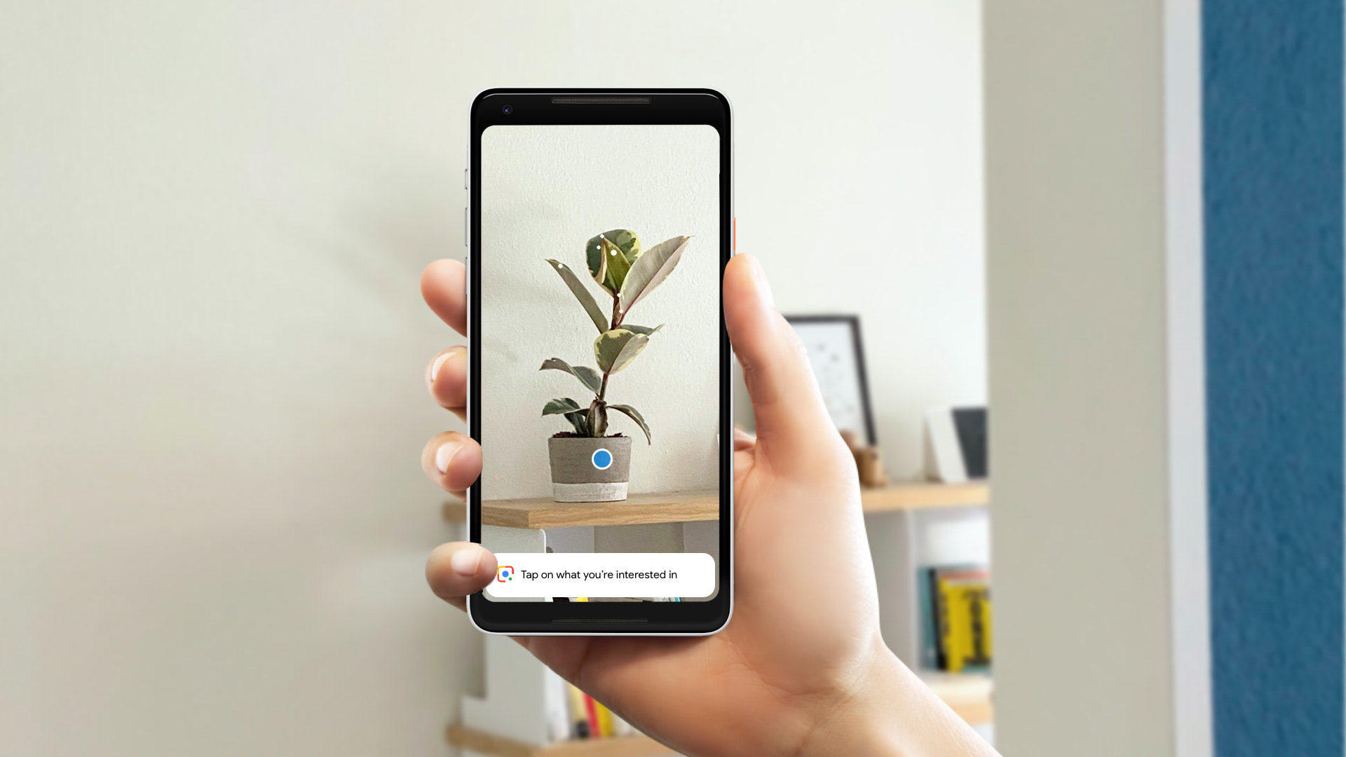
Co-initiated and led the design for Google Lens in Assistant defining core interaction, visual language for seeing, and design unification into one cohesive visual intelligence layer.

Google Lens enables users to search what they see. By pointing the camera at a physical object, Lens provides Google smarts and various object related actions.
Like most journeys, it started with a simple question: what if the Google Assistant had eyes?
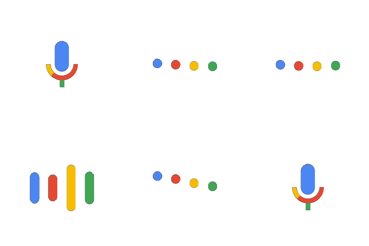
The Google Logo Family with its voice based system served as a foundation to build many assistive products for a wide range of devices.
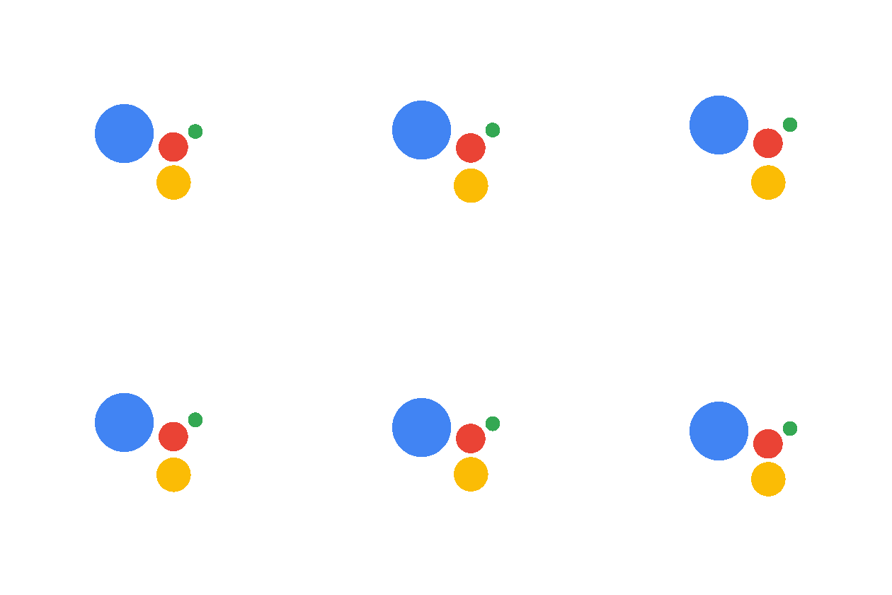
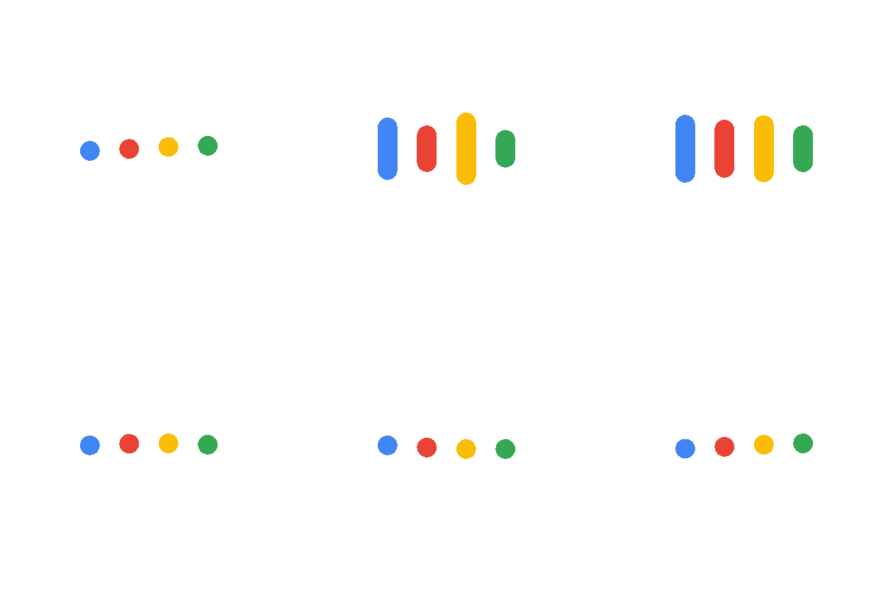
With Google Lens, we had the ambition to evolve the Logo System from a Google that could hear, to a Google that could see.
The traditional colors weren’t just used for the logo type, they also became an integral part of the result experience itself.
The early key challenge was to develop a system that conveys the process of perception in a way that makes the UI obvious. The system needed to work for both moving and still images.
Initially, we intended to draw outlines around objects of interest.
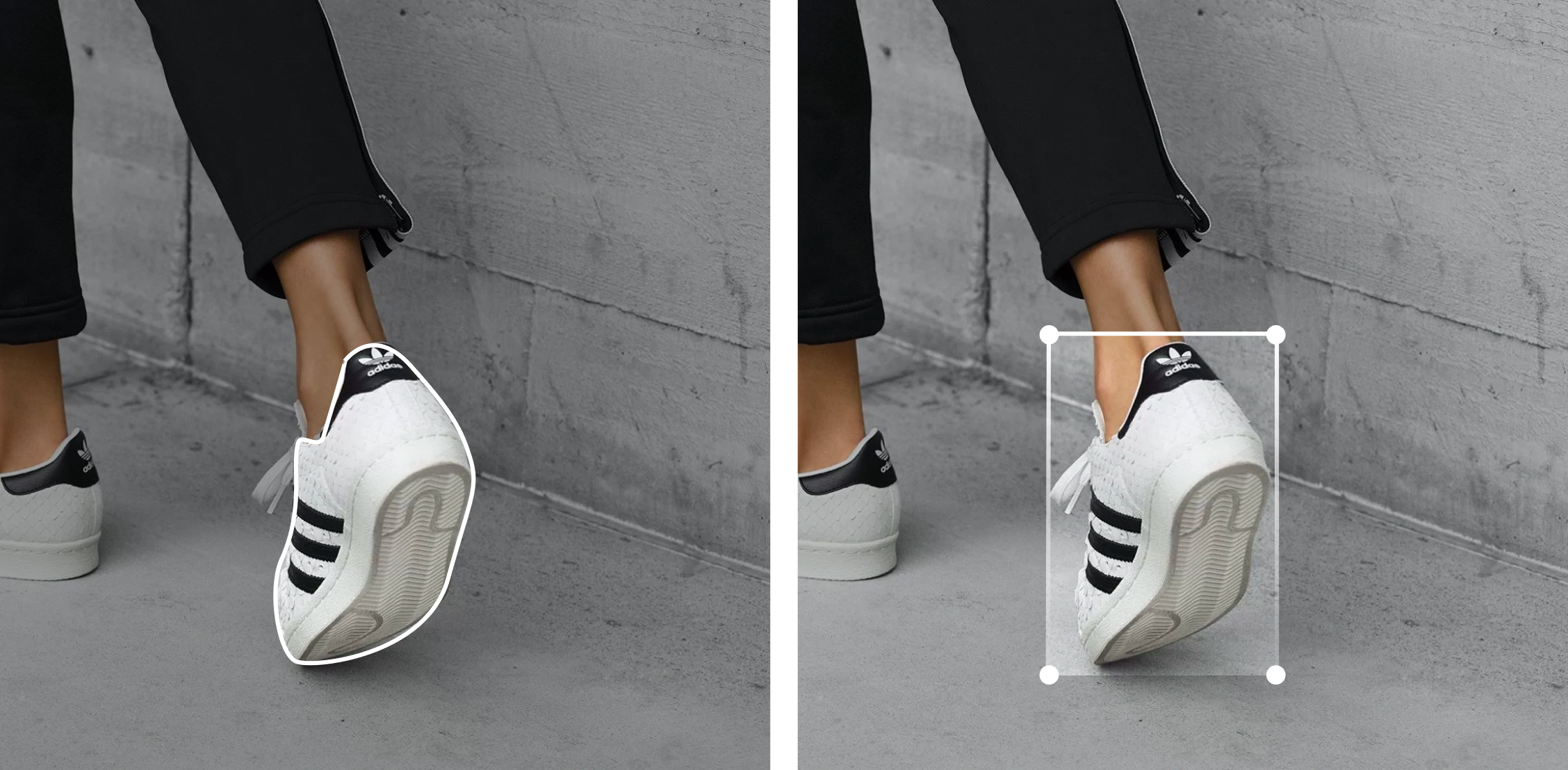
While drawing outlines looked elegant, it required an unheard amount of precision. The team and I advocated for an early concept and UI that is more forgiving, and what I believed more playful: the circle.

Small circles (gleams) represent spots where the AI is trying to identify something, while colored ones represent entities that have successfully been identified.
The engineer team translated the motion proposals into real-time particle systems that would attach themselves to objects of interest.
To avoid overloading the screen with potentially too many entities we used the position of entities to determine their relevance and size.
Lens wasn’t just about pictures. Users could directly interact and copy text from photos or the physical world.
Once the initial building blocks were in place, it became an exercise in identifying a minimum amount of components that would allow to compose a maximum range of results.
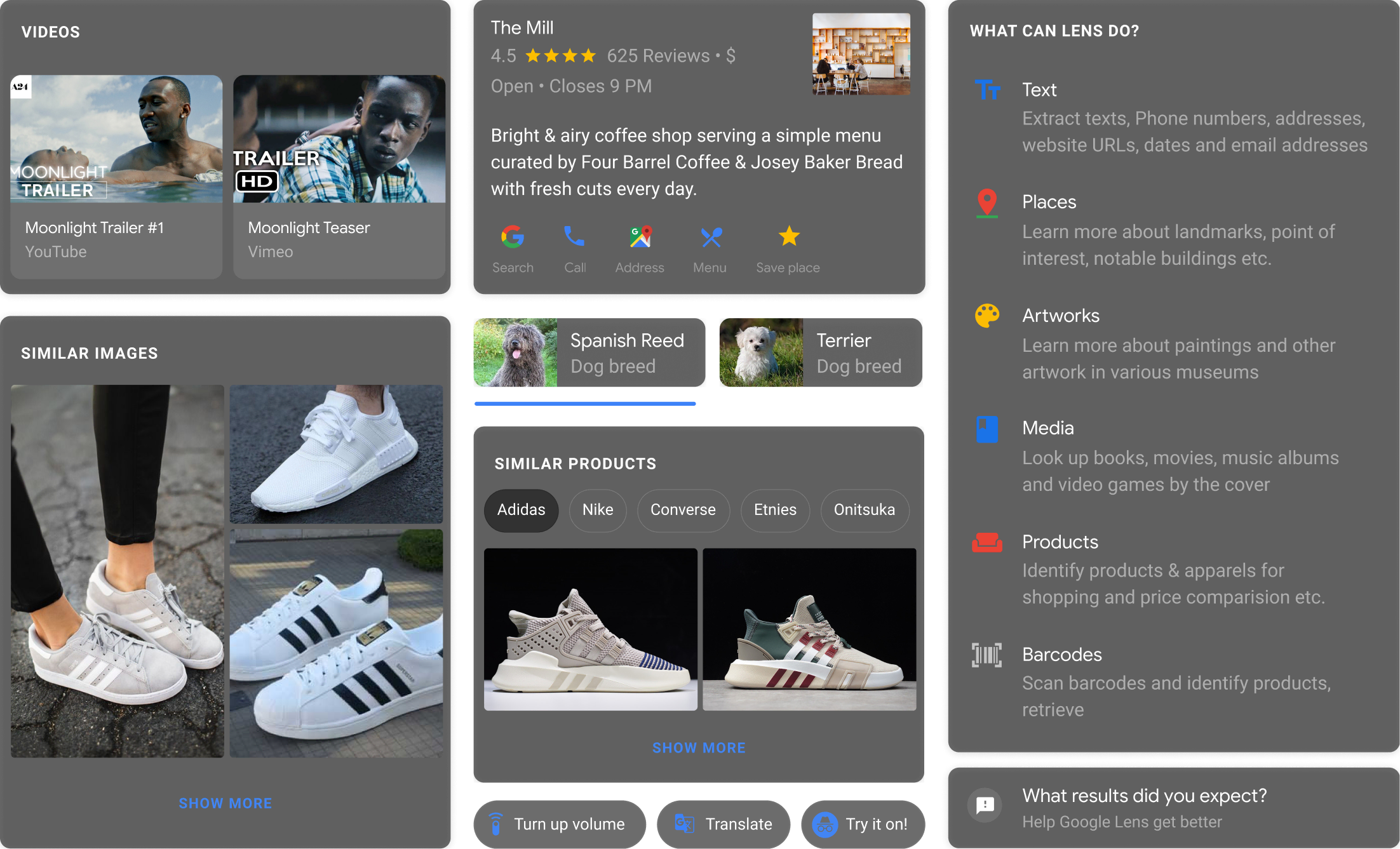
A set of standardized components in conjunction with a visual language for seeing provided the primitives upon which Lens was built.
My team and I heavily advocated for unification. Instead of Lens in Assistant, Lens in Camera, and Lens in Photos, there is just one Lens today — a visual intelligence layer across the phone.
The ability to point the camera at literally anything is both exciting and endlessly challenging. I’m excited how the product evolved and can’t wait to see where the journey is going.
Special thanks to Evan Malahy, Chris Kelley, Jason Kerr, Goekhan Bakhir, Ibrahim Bader, Fred Brewin, Creative Labs, and the Lens team.